A guide to choosing the right shade of white paint
Did you know that painting a dark room with pure brilliant white paint, will actually make the room feel more dark and dingy? It’s because it will reflect blue tones, making it feel even colder.
There’s a few tricks to choosing the right shade of white for your room, so I’ve put together my favourite white shades to help you - whether you’re going for an all white scheme or pairing white with another colour.
For the sake of brevity I have stuck to my three favourite paint brands; Farrow & Ball, Little Greene, and COAT.
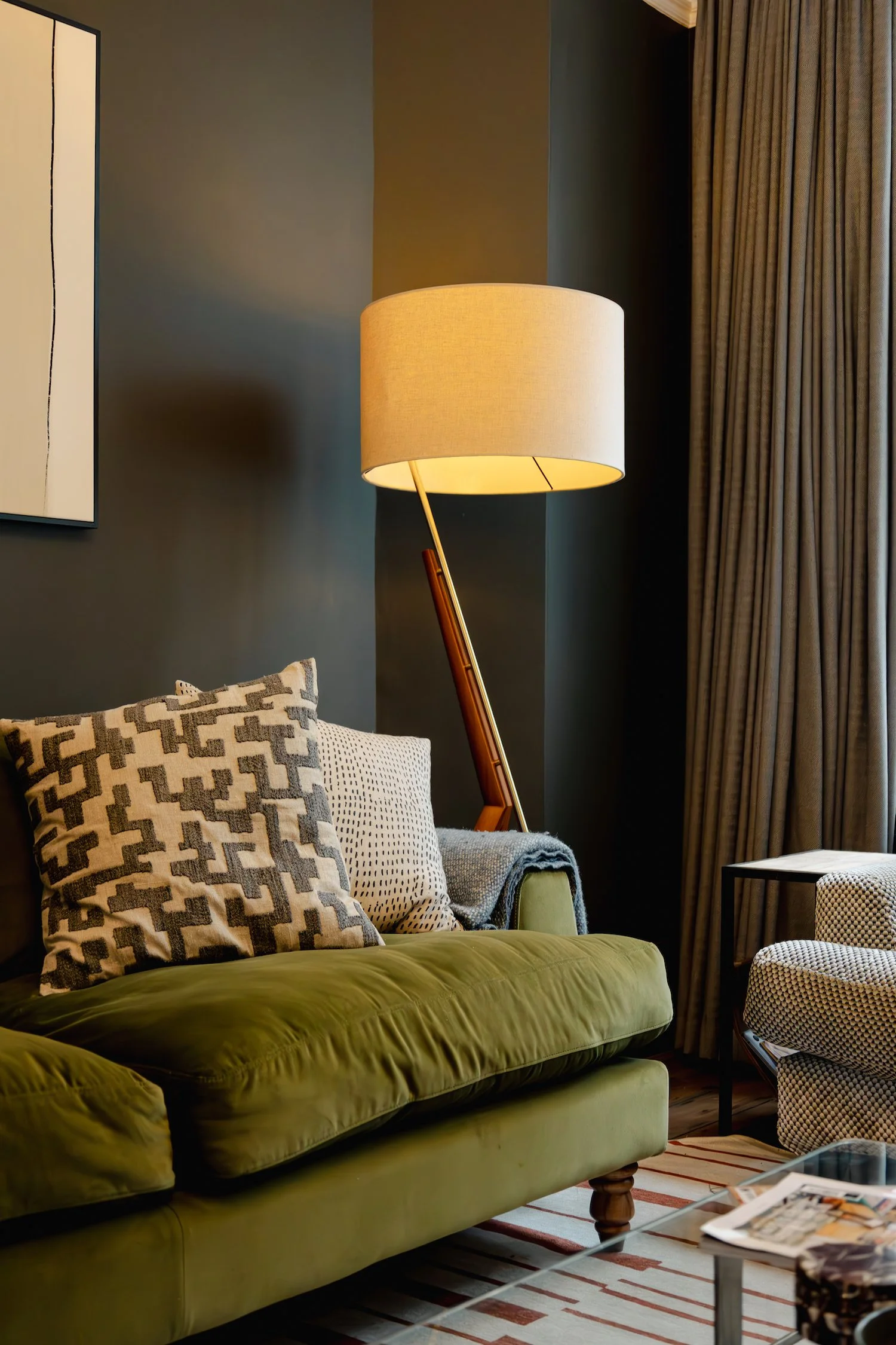
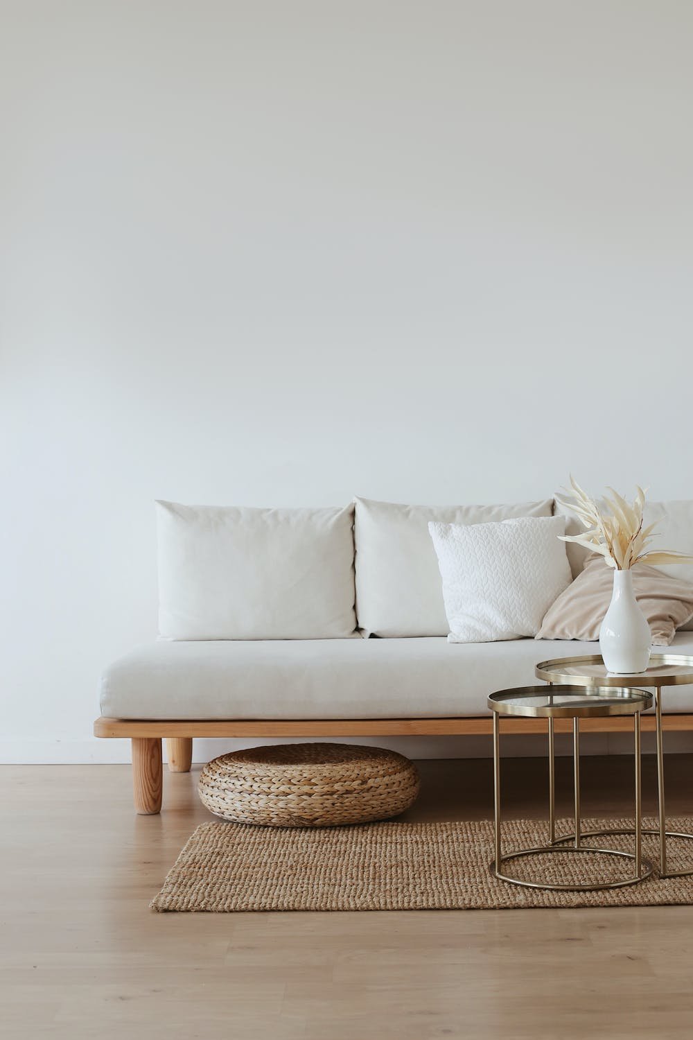
North facing or dark rooms
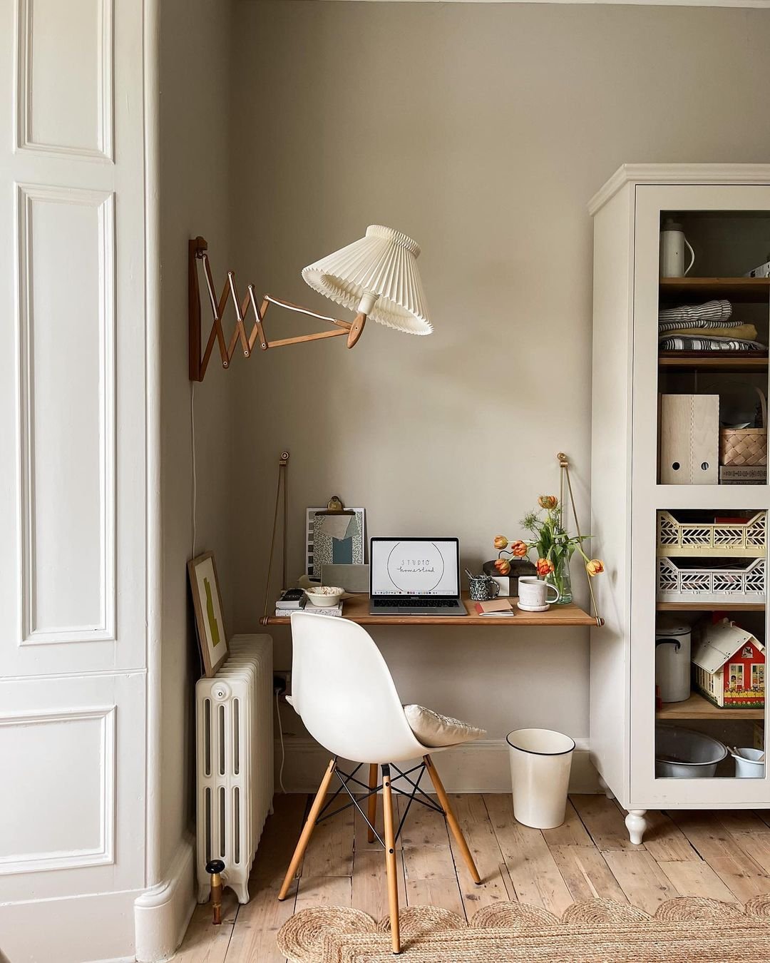
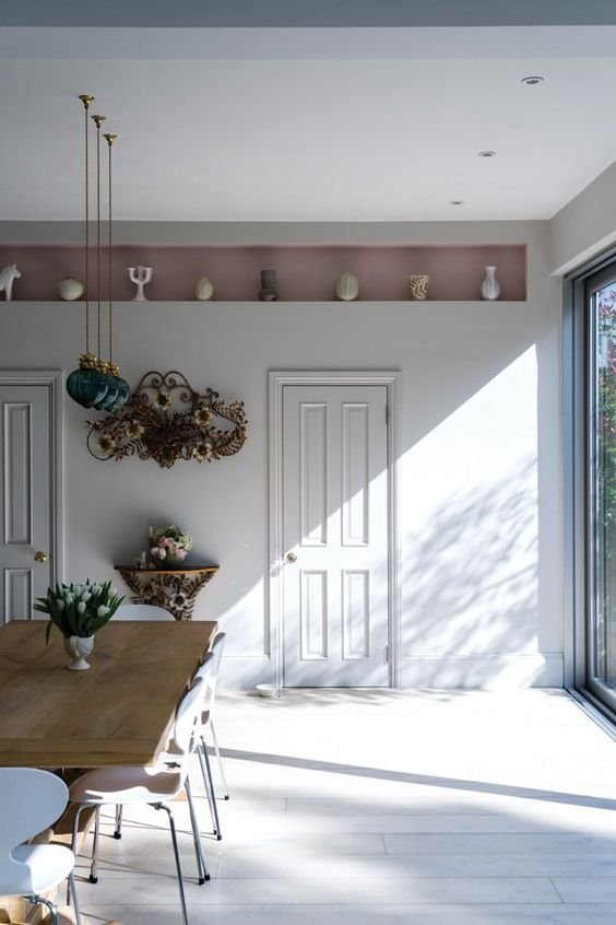
Wimborne White, Farrow & Ball. Design by Studio Homestead
As I mentioned before, the worst thing you can do in a dark or drab room is to add brilliant white. Instead, you want to reverse the cool light by using a warmer white - so one with a warm undertone like yellow or red.
My favourites:
Slipper Satin - Farrow & Ball
Wimborne White - Farrow & Ball
Slaked Lime - Little Greene


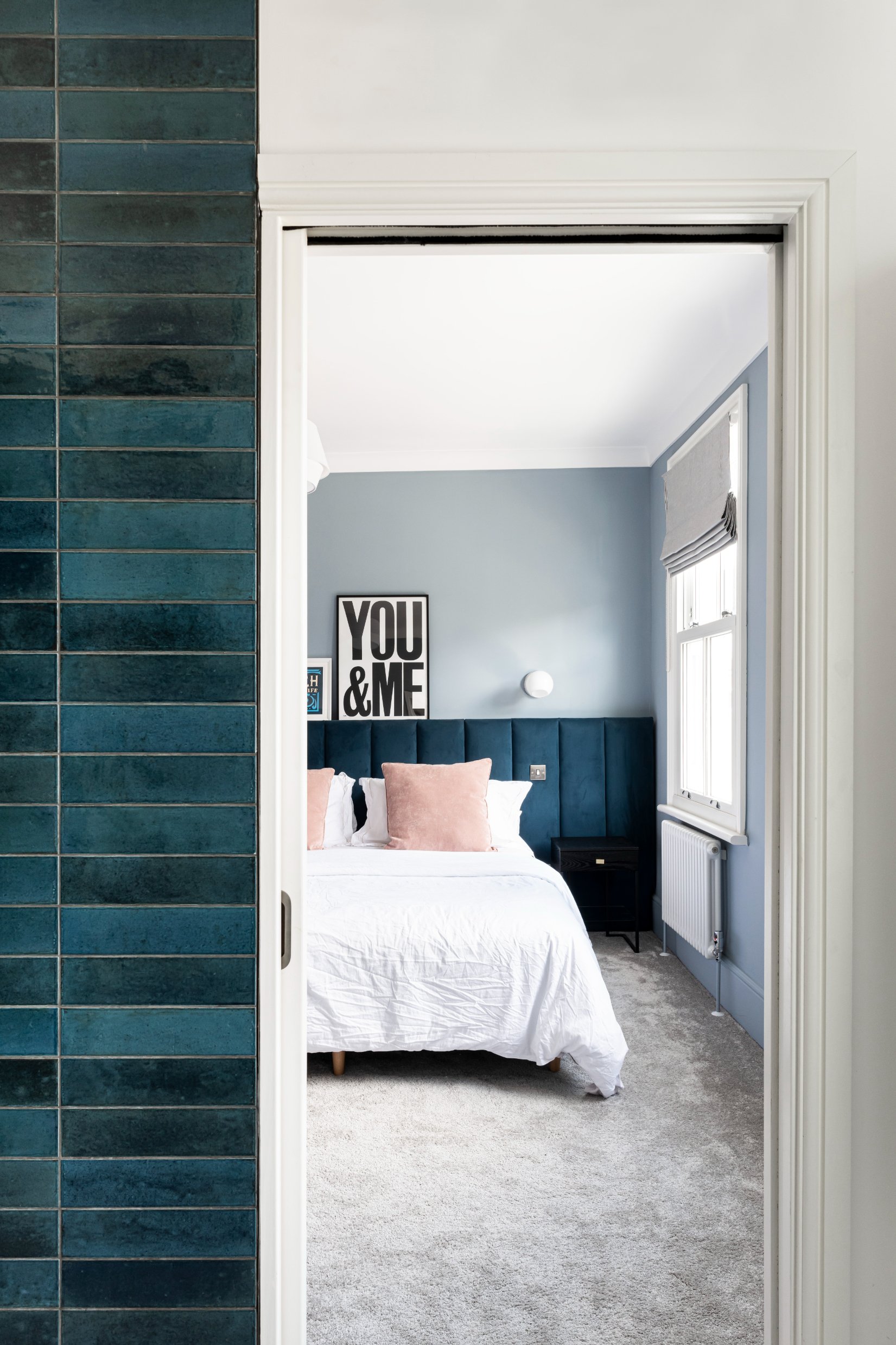
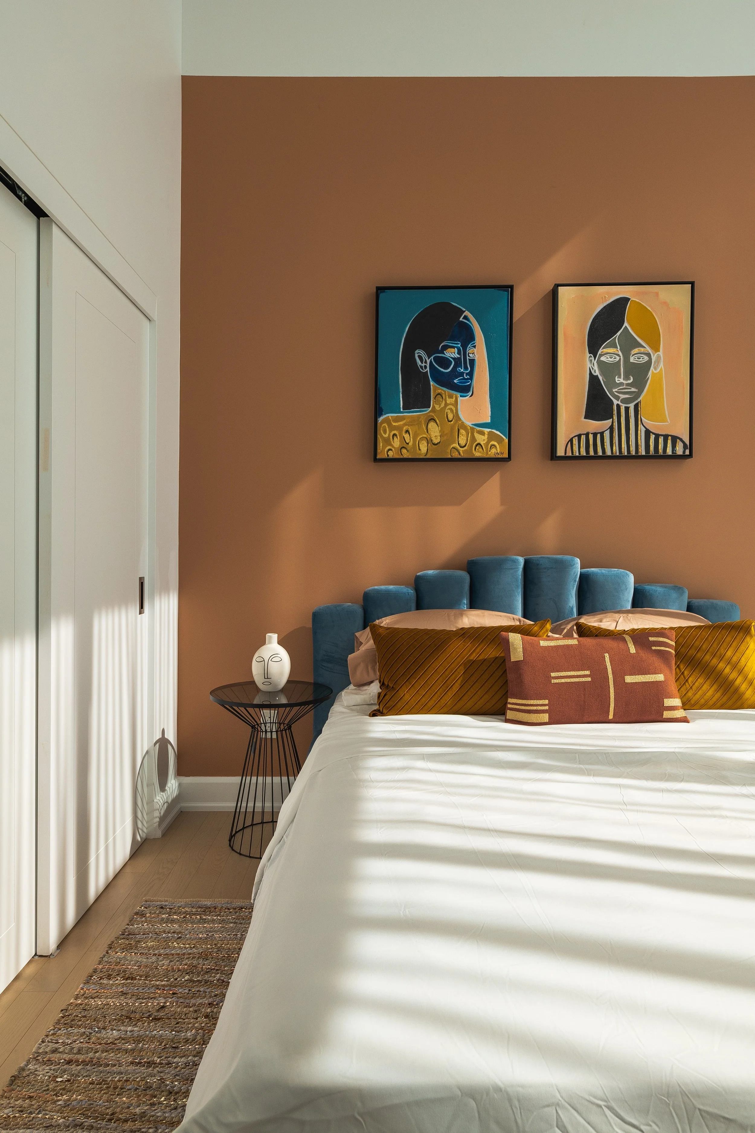
Bright or South facing rooms
Blackened, Farrow & Ball. Image c/o Farrow & Ball
If you use a warm white in a bright or South facing room, you might find that it comes across as too cream or yellow, which might not be what you’re after. Instead, you can balance that warm light with a white which has a grey or blue undertone. It’ll make the room feel bright and airy without feeling too warm, or too cold.
My favourites:
Strong White - Farrow & Ball
Blackened - Farrow & Ball
Low Salt - COAT


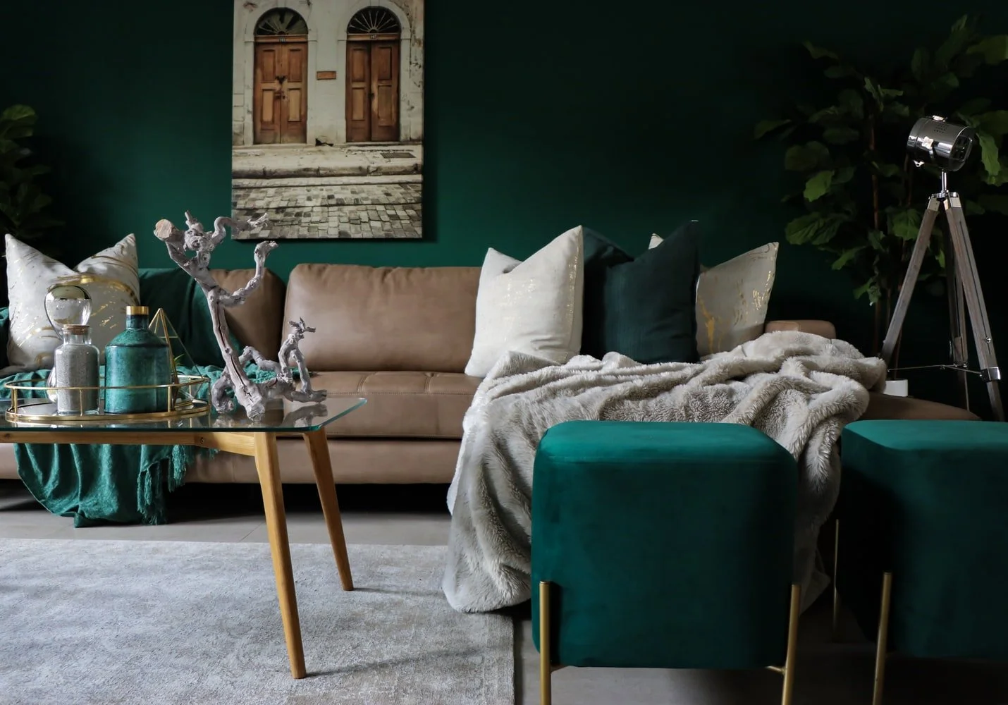
Goes well with blue and green

Farrow & Ball Wevet with green, design by Pretty In Print
When pairing white with another colour, ideally you want to match the undertones of the paint. Blue and cool greens have cooler undertones, so pair them with a white with the same cool blue, green, or grey undertone.
My favourites:
Wevet - Farrow & Ball
Wood Ash - Little Greene
Slipper Satin - Farrow & Ball


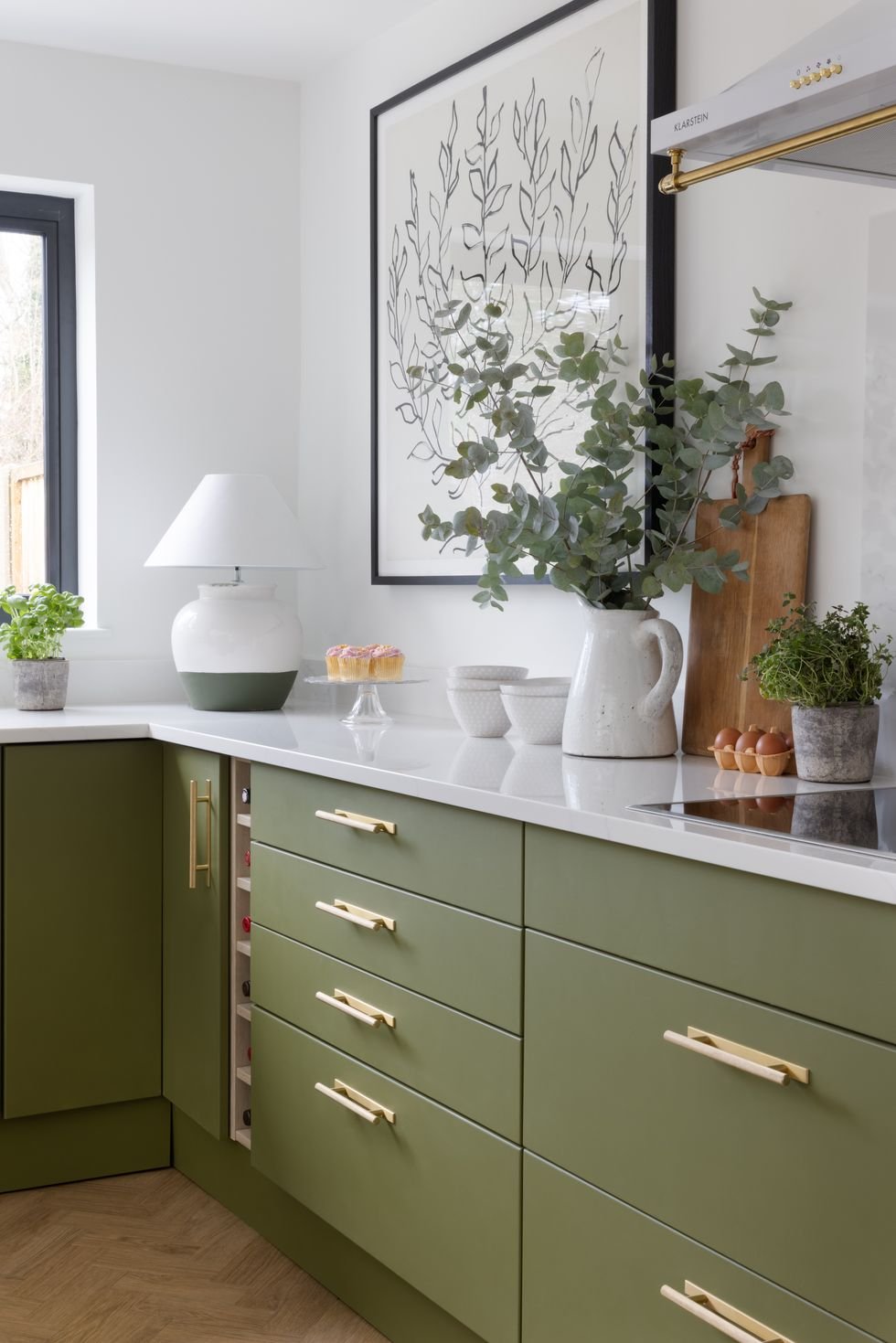
Goes well with olive green and yellow

Kind Regards by COAT in the home of @victorian home 28
Likewise, yellow and olive green have (you guessed it) warm undertones, and so they pair well with a white which also has a warm yellow or cream undertone.
My favourites:
James White - Farrow & Ball
Slaked Lime - Little Greene
Kind Regards - COAT


Goes well with pink

Dimity by Farrow & Ball. Design by @karlas_view
Pink paint, especially one with a warm undertone, will go beautifully with a white which matches these warm undertones, with a hint of red.
My favourites:
French Grey Pale - Little Greene
Portland Stone Pale - Little Greene
Dimity - Farrow & Ball


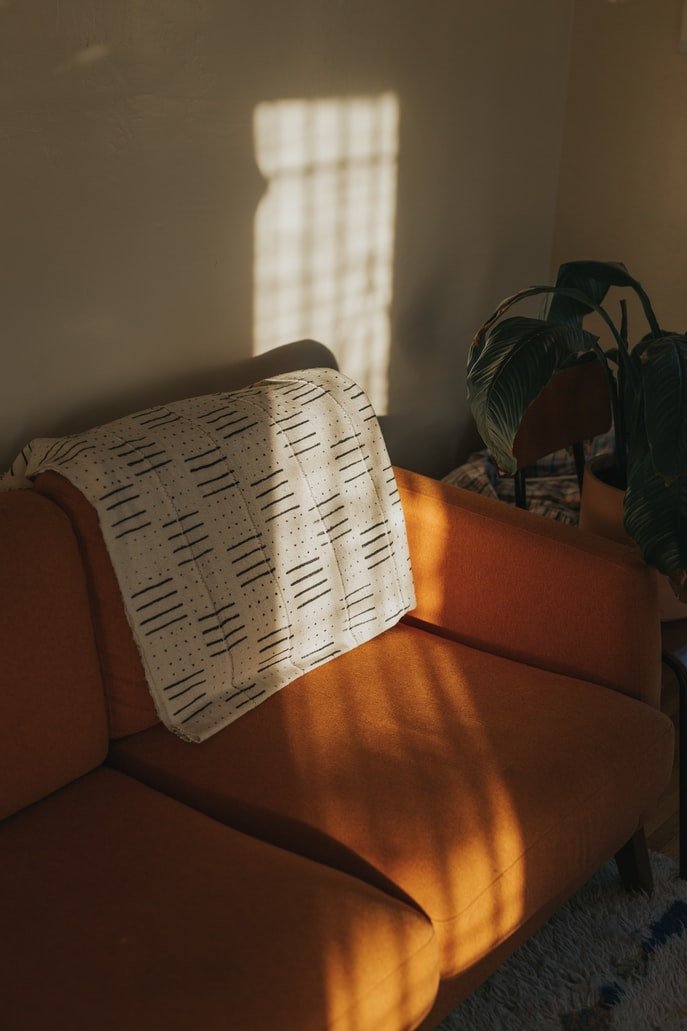
Good for woodwork

Image from Apartment Therapy
You have 2 options for woodwork, if you’re going for a white scheme. Firstly, you can carry the colour that you’re using all over the woodwork, the walls and the ceiling for a completely seamless look. Alternatively, pairing your white with a completely neutral white will add some contrast and bring out the undertones of your chosen white.
My favourites:
Screenshot - COAT
All White - Farrow & Ball
Loft White - Little Greene


If you’d like my help with your next project, check out my services to see how we can work together. If you’ve enjoyed this blog, don’t forget to subscribe below to receive my new post in your inbox every Sunday.