How to link a colour scheme throughout your home
Putting together a colour scheme for your entire home is a daunting concept. Ideally you want the colours in your space to be cohesive, but with a balance between feeling too matchy-matchy or flat and monotonous. Luckily, it’s not that hard to do with a bit of planning!
Start pinning and collecting inspiration

The very first step when planning a colour scheme, whether it’s for a room or for your entire home, is to start collecting inspiration. Pinterest is amazing for this.
Start searching for inspiration, and then save anything where the colour speaks to you. Ignore style for the time being but focus on the colours.
Once you’ve pinned about 50 rooms or so, you will probably see that there’s a common theme in the colours that you like.
Choose your colour family
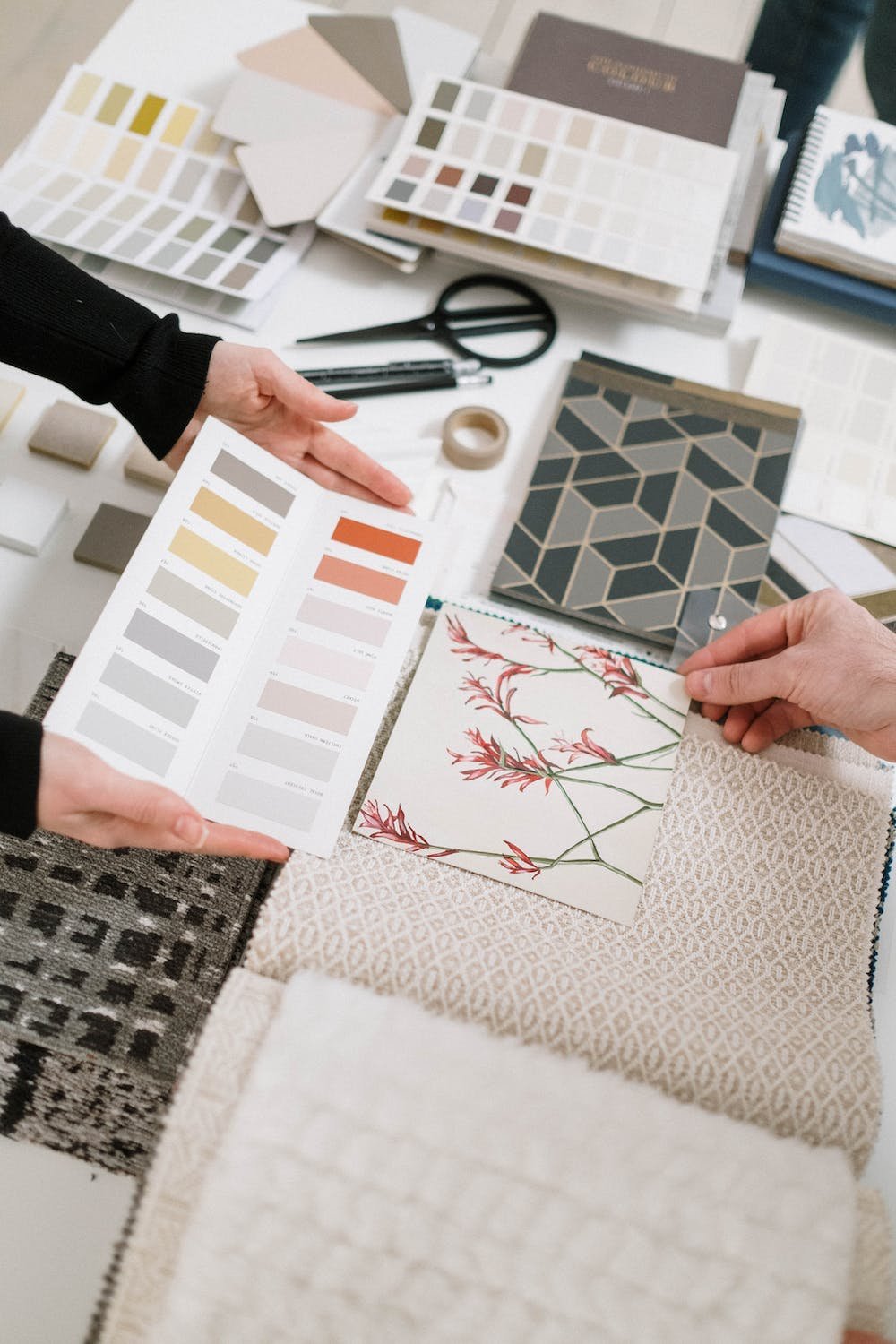
Paint and fabric samples

An autumnal colour family
Now that you’ve identified the colours that you’re drawn to, try to widen this to a theme - I like to think of this as a family.
Maybe they’re muted and pastel, maybe they’re warm and autumnal, maybe they’re very saturated and lively. There should be a wide range of colours in the family so that you have a lot to choose from, but they all feel “related” and sit well together. If you were to take any two out and put them side by side, they should complement each other.
Once you’ve identified a group or family of colours, this makes it so much easier to narrow down your colour choices for each room within your home. I recommend having a physical version of the colours - a collection of paint or fabric samples is ideal.
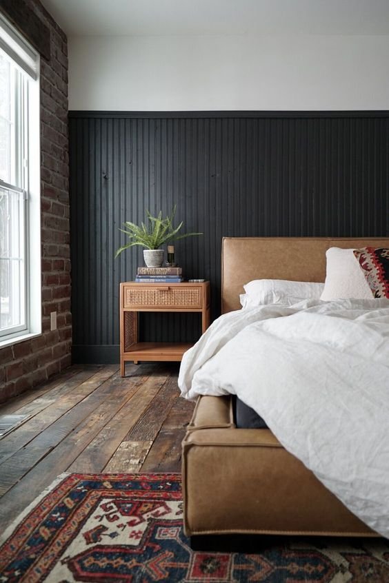
Pick your “red thread” and other continuous elements

Source: Studio Rey
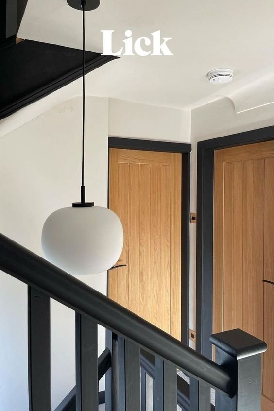
Source: Lick
The red thread in interior design is the concept of having one subtle element that repeats throughout your home, linking each space. Subtle is the key word here - it doesn’t need to be blindingly obvious, but just present enough so that it acts as a cohesive thread throughout your home.
This could be any number of things. It could be a pattern repeated, maybe it’s on a roman blind in one room and on a cushion in another. Or an accent colour in your art work and accessories.
Other elements that I like to keep cohesive between rooms is the skirting/trim colour, and the type of wood and metals. I’m definitely not saying that you should only stick to one type of wood and metal however - I usually pick three metals and three wood tones and try to stick within them throughout the home.
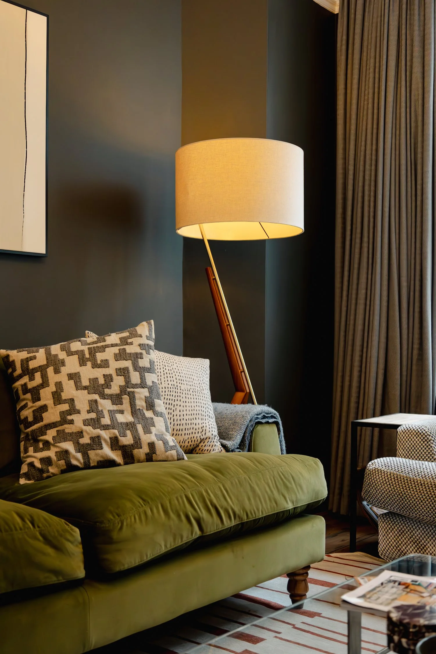
Choose a connecting colour for your hallways

Source: Malcolm Menzies

Source: Allison Babcock Design
Hallways are tricky. They connect all the rooms, they often don’t have great lighting, and they also act as the first impression into your home. They also absolutely hoover up paint so can be the most expensive in terms of labour and paint costs - so it’s best to get your hallway colour right the first time round.
I usually tend to go with a light neutral in the hallway - pick a colour from your already established colour family, and you already know it will link cohesively with all of the other colours you choose.
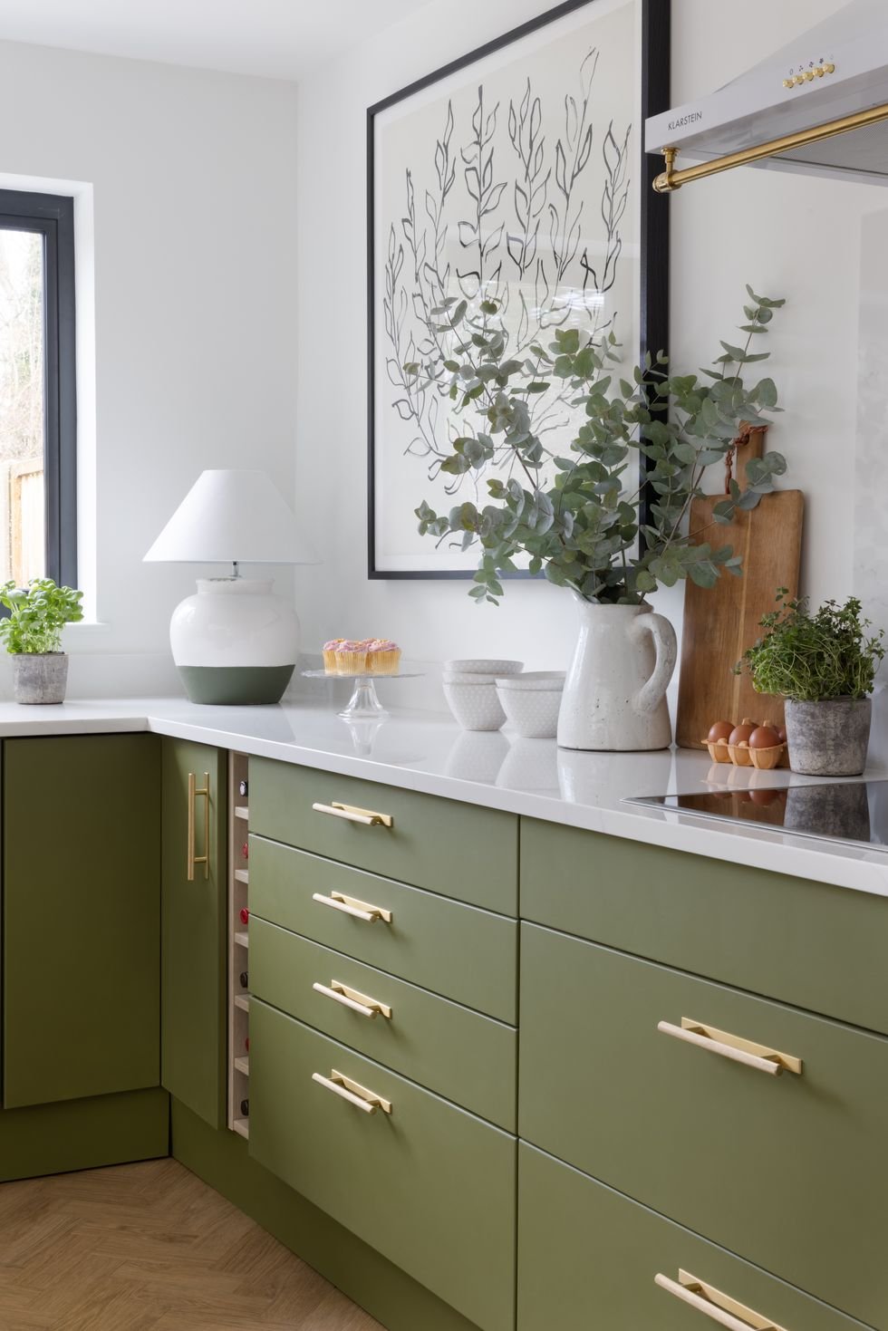
Start with the room you spend the most time in

Source: Q Design House

Source: Paint and Paper Library
I always suggest to start with the room(s) that you spend the most time in, usually the living room, kitchen, and the bedroom.
When choosing colours for each individual room, I would ask myself the following questions:
How do I want to feel in this room? Cosy and comfy? Energetic? Calm?
How much light does this room get and at what time of day? Is it always dark? Does it get an orange glow in the evening?
What elements in this room are staying? The floor? A sofa?
Answering these questions should help you narrow down from your colour family which colours are appropriate for the room.
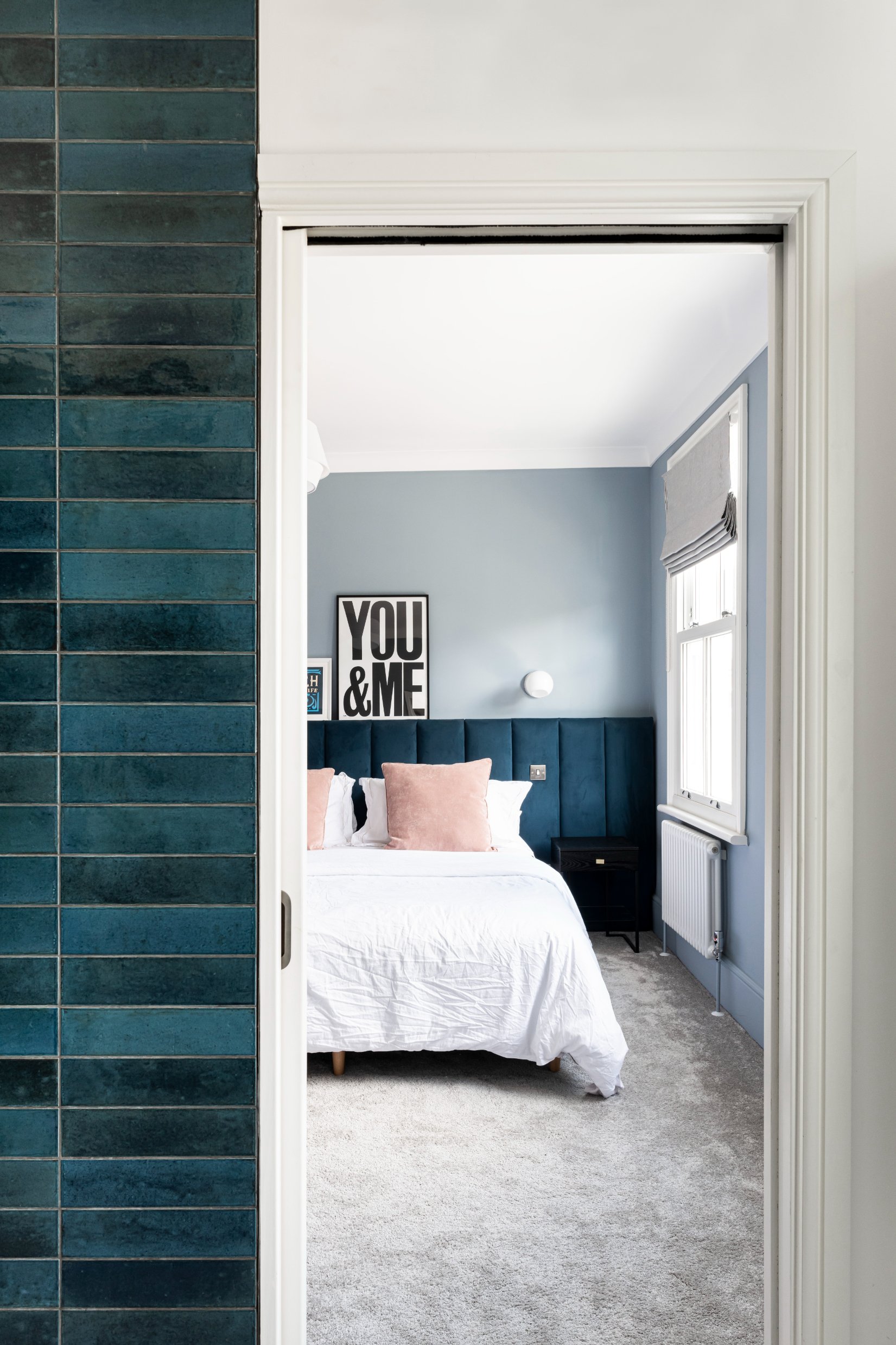
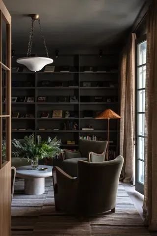
Think about sight-lines

Source: Luke Edward Hall

Source: Little Greene
Since you’ve already chosen a colour family, you know that all of the colours go well next to each other. The reason this is important is because of sight-lines - the view you get from different points in your home. It could be from your front door all the way through to your kitchen, or maybe from your living room into the study.
So when you’re planning colours for each room, just take a second to consider what the view will be from different points in your home.
Try not to paint every room the same colour

Paint & Paper Library

Farrow & Ball
My final piece of advice is to try to avoid the temptation to paint everything the same colour. Especially not bright white. I’ve often had to clients who’ve done this to avoid having to think about colours, but the result can sometimes result in a monotonous or flat feeling home.
If you really do want white walls throughout your home, I’d suggest following the same advice in this post but apply it to everything except the walls, so soft furnishings, art, rugs and furniture.
If you’d like my help with your next project, check out my services to see how we can work together. If you’ve enjoyed this blog, don’t forget to subscribe at the bottom of this page to receive my new post in your inbox every Sunday.