How to decorate with different shades of green
My favourite colour, green, is a really versatile colour for decorating with. Whether you go for a pale and muted green or a punchier jewel tone, it’s a great option for any room. Plus, it’s associated with creativity, nature and the outdoors and can make a space feel calming and relaxing.
Here’s how to bring green into your decorating.
Sage green
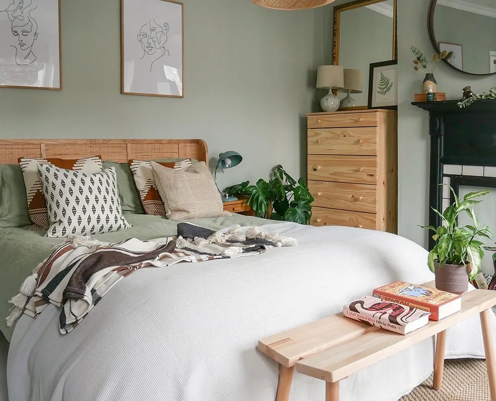
Sage green bedroom, by This 1870 House
Sage green is a very calming and relaxing shade of green, making it a very good choice for a bedroom. Sometimes I find that it can look a little washed out, so adding plenty of texture and interest is key.
Sage green lends itself to natural, organic and boho style spaces, so it pairs really well with materials like light or bleached wood, rattan, wicker and linen.
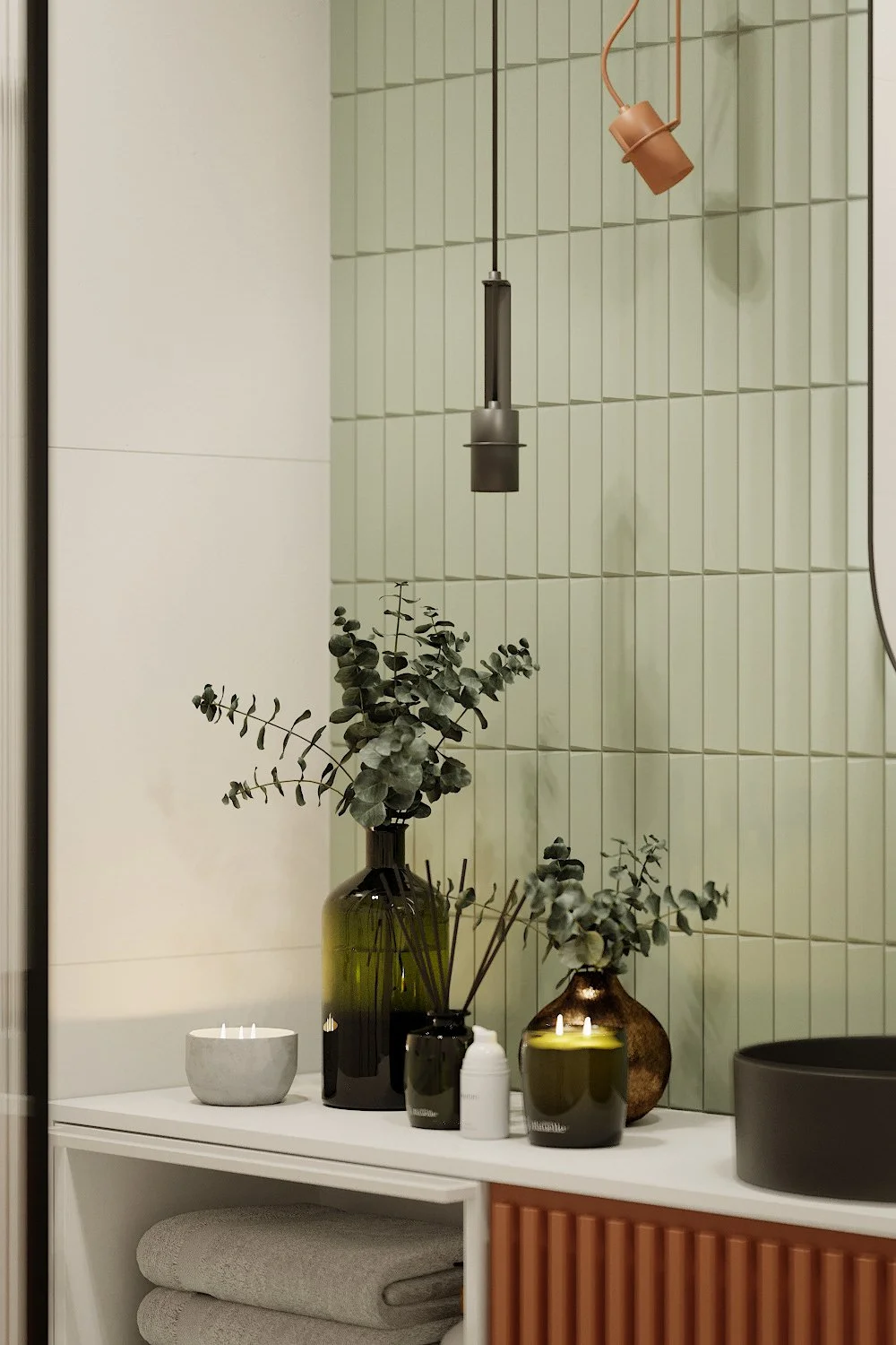
Sage bathroom, Ivano Frankivsk
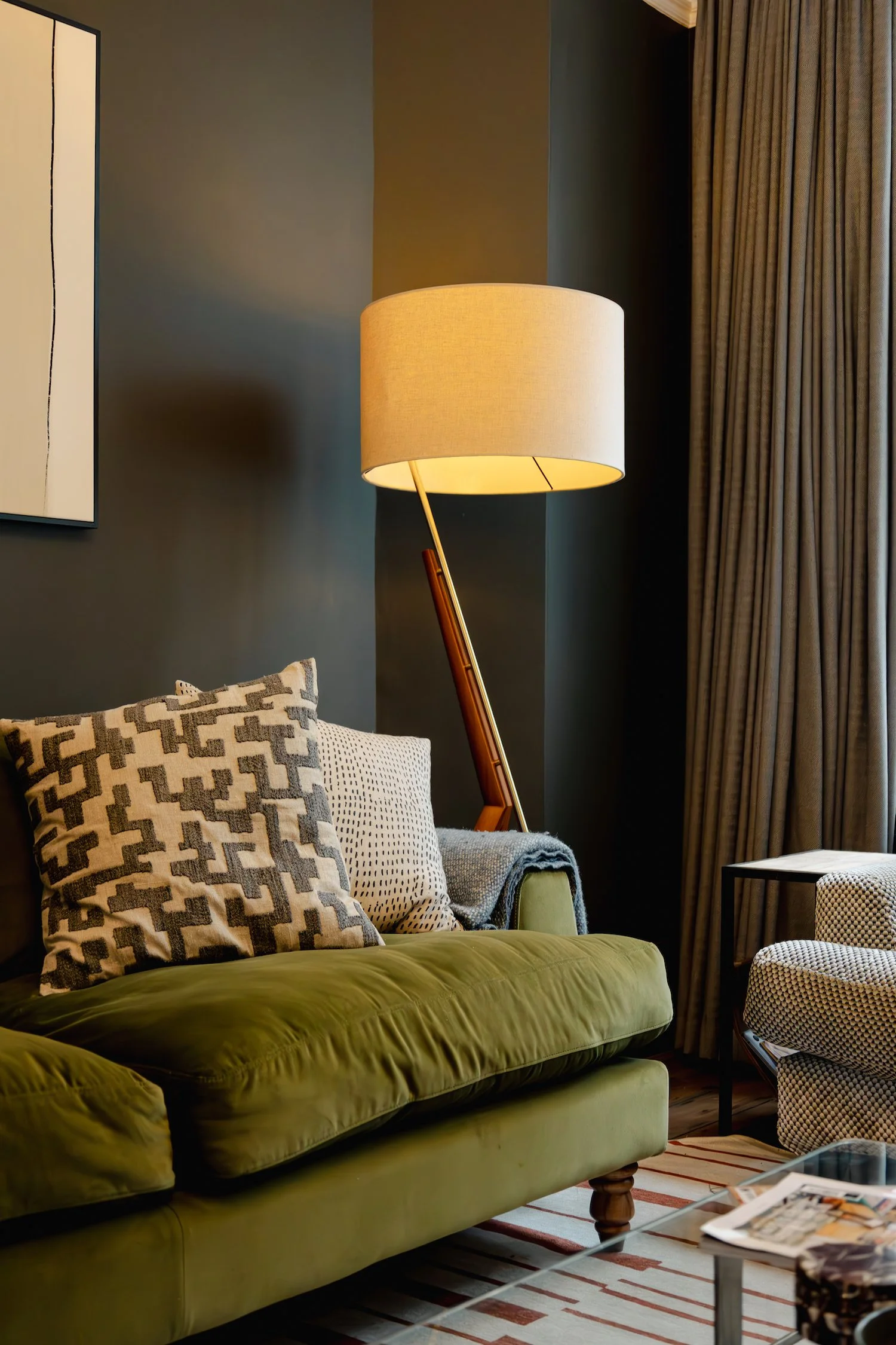
Olive green
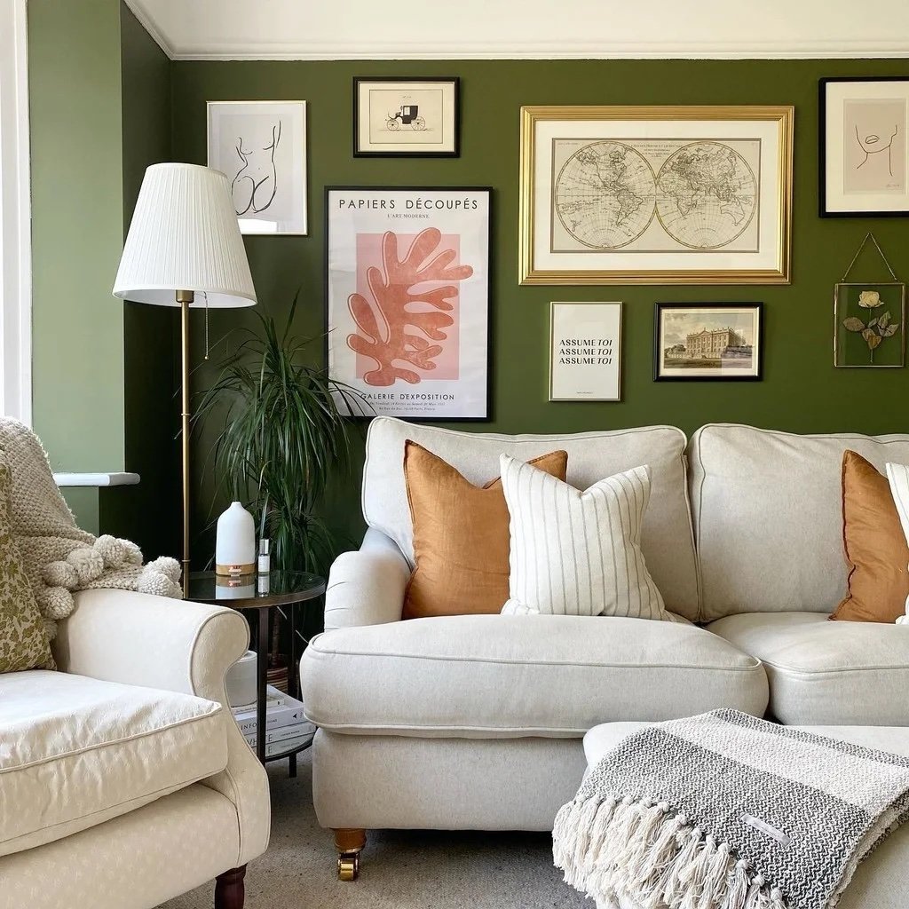
Image from Farrow & Ball, paint colour: Bancha
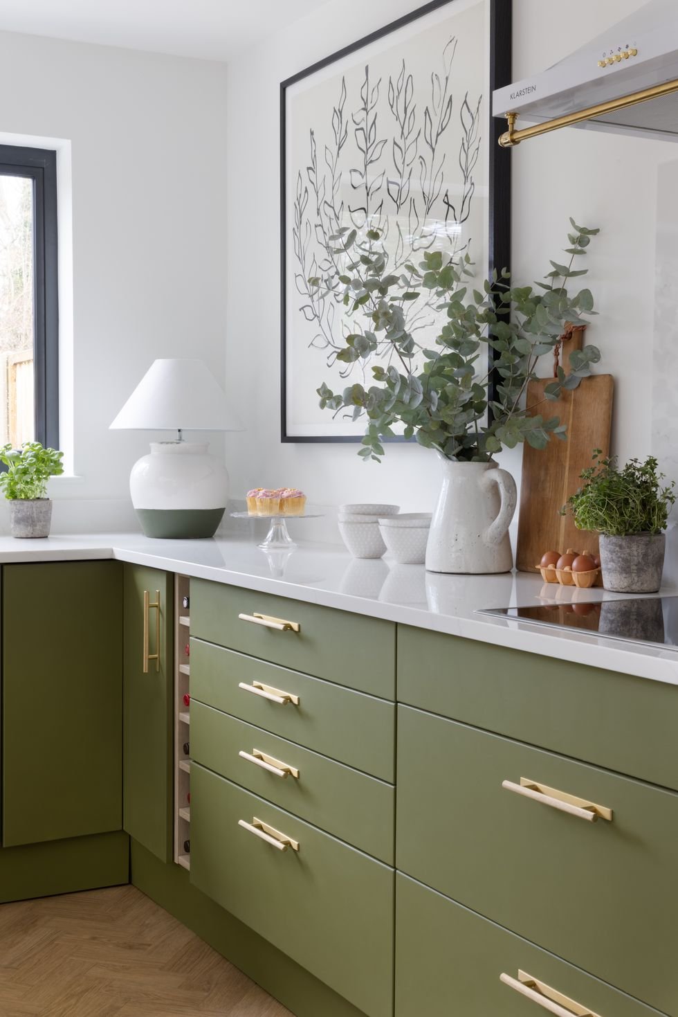
My favourite green! Olive green is a deep yellowy green, which sits between green and yellow on the colour wheel. A classic mid-century colour, it sits really well within a mid-century colour palette - so rust, navy, mustard, peach.
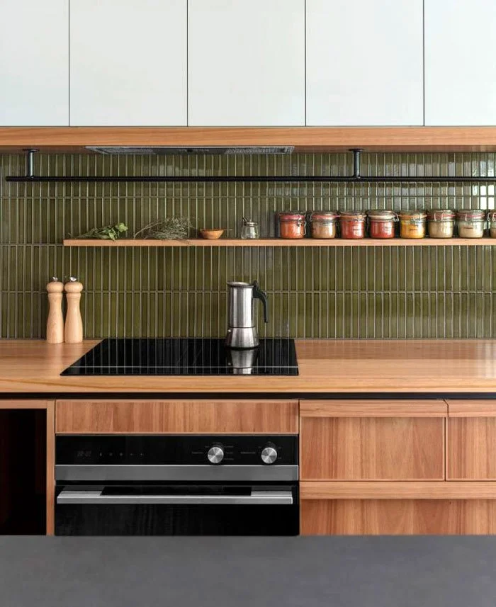
As with all greens, wood furniture goes particularly well with olive, especially walnut.
Design by Murray Barker
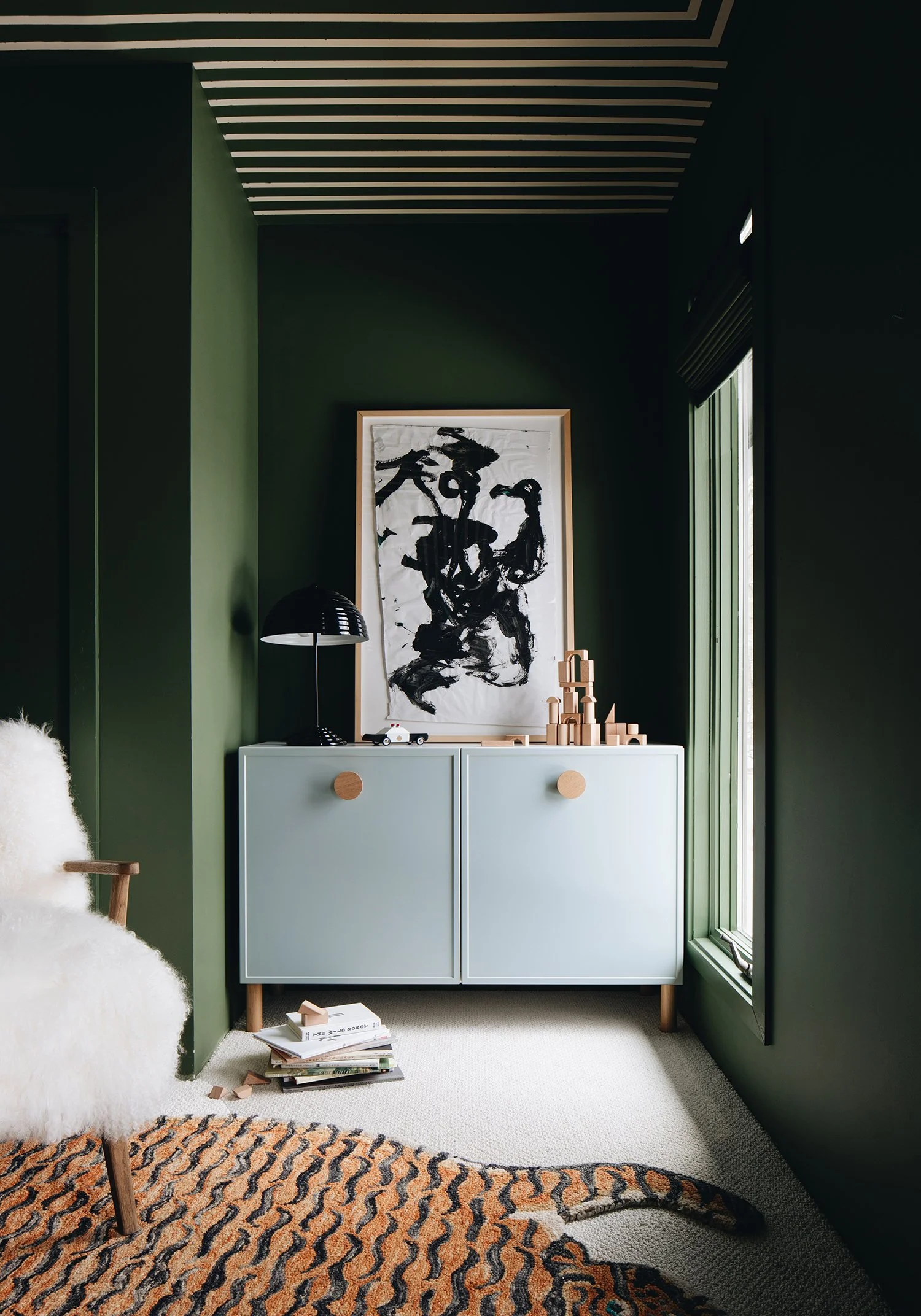
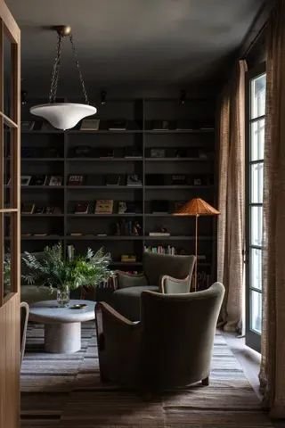
Forest green
Similar to olive green, forest green is a darker version which still has a hint of yellow - similar to the colour you’d find in a forest (funnily enough..)
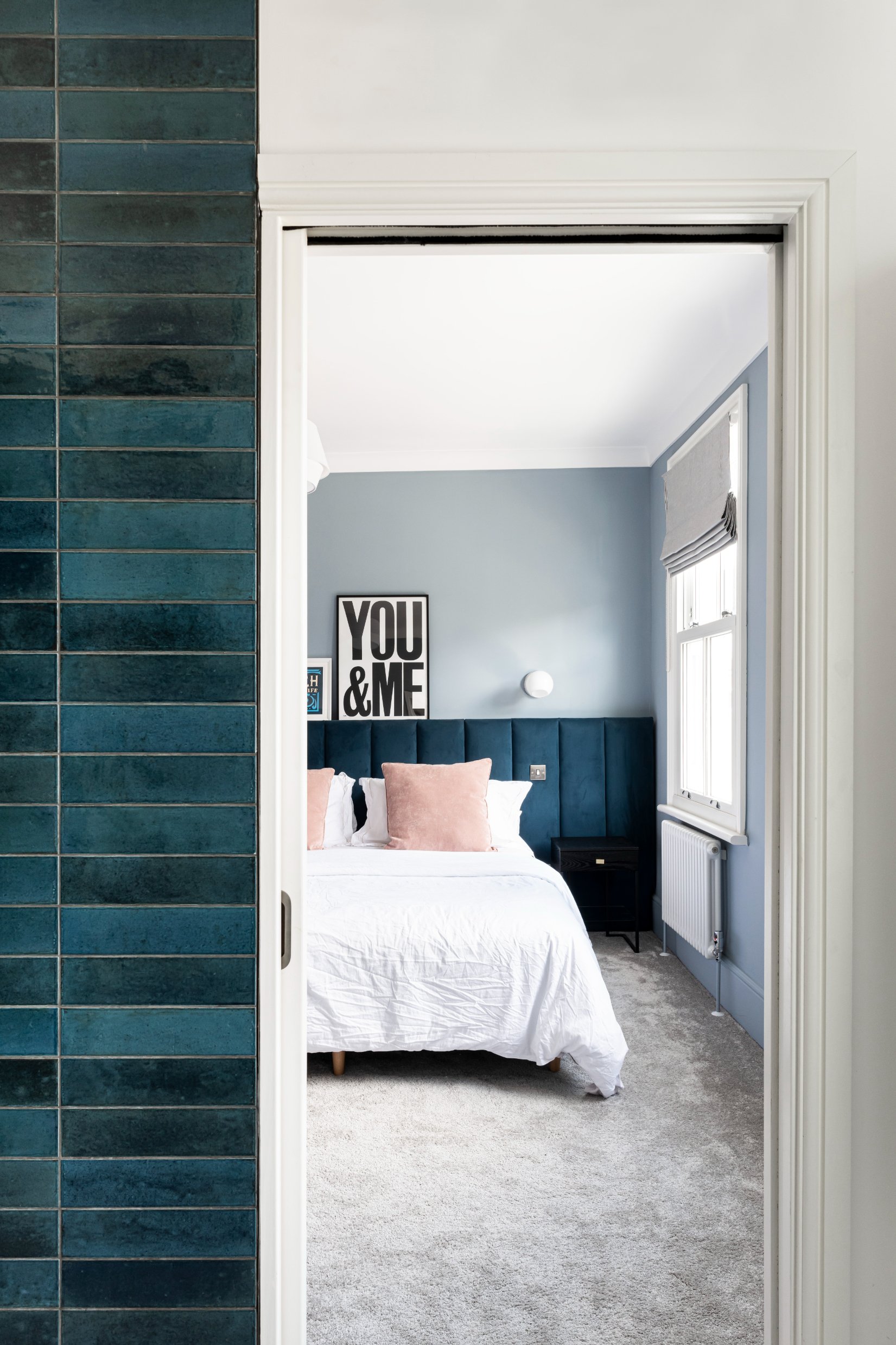
It looks particularly great against white and lighter colours - whether that’s your trims, furniture, radiators or art. In the example above you can see that the white radiator really makes the green pop, and below the light blue cabinet has the same impact.
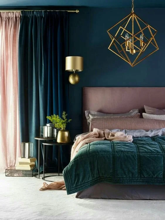
Emerald green
Image from Pinterest
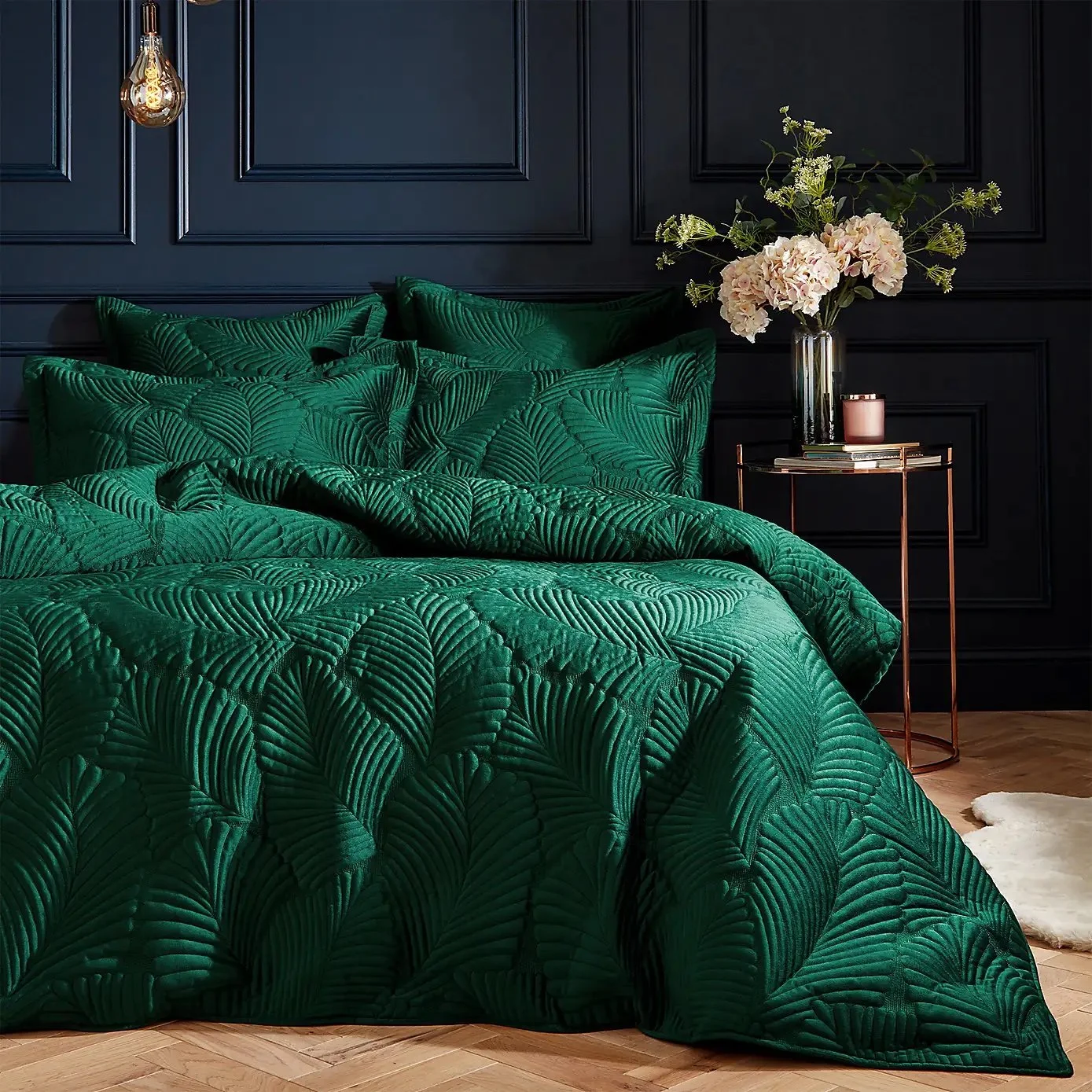
I would describe emerald as quite a luxurious colour - it’ s a bright blue-green named after the gem stone.
It pairs well with other luxurious and gem-toned colours, like pink, navy, ruby and sapphire, as well as rich metals like gold and copper and velvet fabrics.
From Dunelm
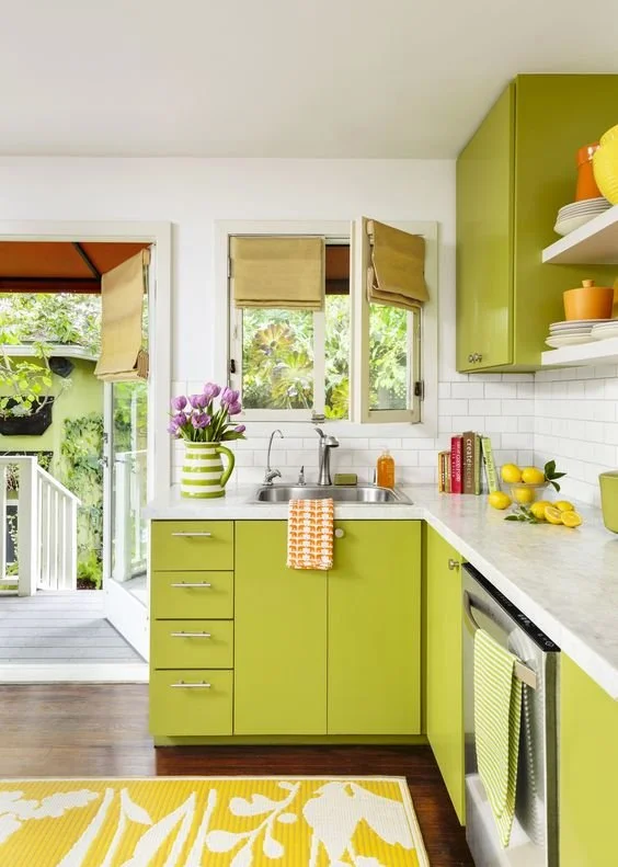
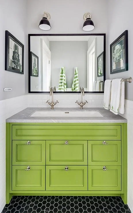
Lime Green
Image from This Old House
Quite tricky to get right without it looking overwhelming, lime green is a very punchy citrus colour, best reserved for rooms in which you want to feel upbeat or energised, like a kitchen or playroom.
I see two options for lime green - you could use is as part of a bright and colourful scheme and pair it with other bright and upbeat colours like yellow, orange and white. Alternatively, using lime as a pop of colour against a more neutral backdrop would an be impactful choice.
Image from Decorpad
If you’d like my help with your next project, check out my services to see how we can work together. If you’ve enjoyed this blog, don’t forget to subscribe below to receive my new post in your inbox every Sunday.


