Common interior design mistakes and how to fix them
I’m not someone who will come into your home and judge you or your taste, but there are a couple of common issues that I come across when talking to my clients. Quite often it means that a room doesn’t work as well as it could, but we’re in luck because they’re normally easy to resolve. Here’s how to fix some of these design mistakes.
Pushing all the furniture against the wall
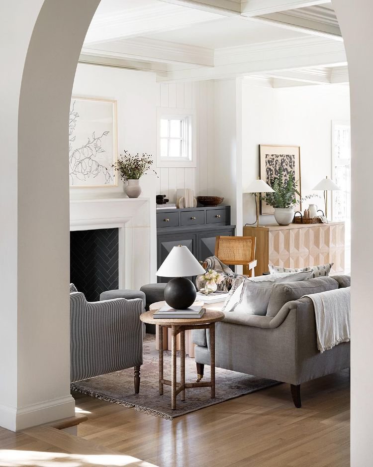
Living room layout, by Studio McGee
When presented with an empty room, the logical thing might seem to take your furniture and put it against each wall, in order to keep the room feeling large and spacious. But doing this often makes for an awkward layout with too much empty space in the middle of the room.
You can be creative by positioning sofas and armchairs at right angles or away from the wall, allowing a flow through the room and zoning of separate areas. As a rule of thumb you need about 80cm of space for a person to move freely behind a piece of furniture.
Desk up against the back of a sofa, from House Seven Design
Rugs that are too small
Via House & Garden
I probably sound like a broken record with this one but I believe this can have such a big impact on a space. Rugs that are too small look like they’re floating awkwardly in the middle of a room, whereas if you go for a much bigger one it’ll make the space feel larger as well as connecting all the furniture around it.
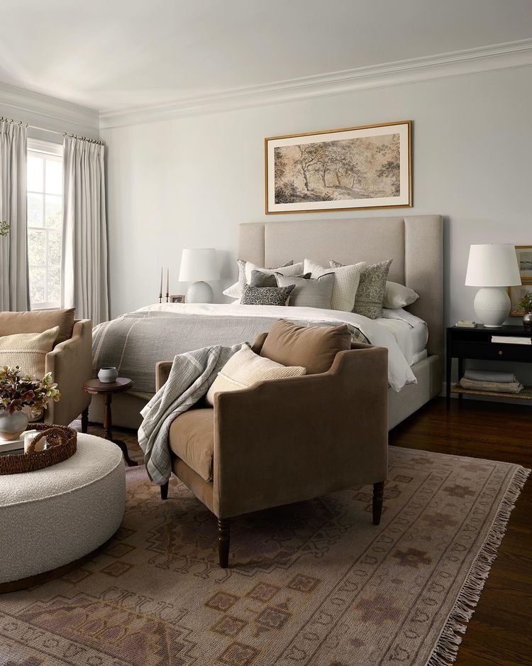
As a rule of thumb, try getting at least the front 2 legs of your furniture (sofa, armchairs) onto the rug, and if under a bed, ideally at least 60cm extending from each side and the foot of the bed.
See my blog post: How to choose the right rug
Design by Studio McGee
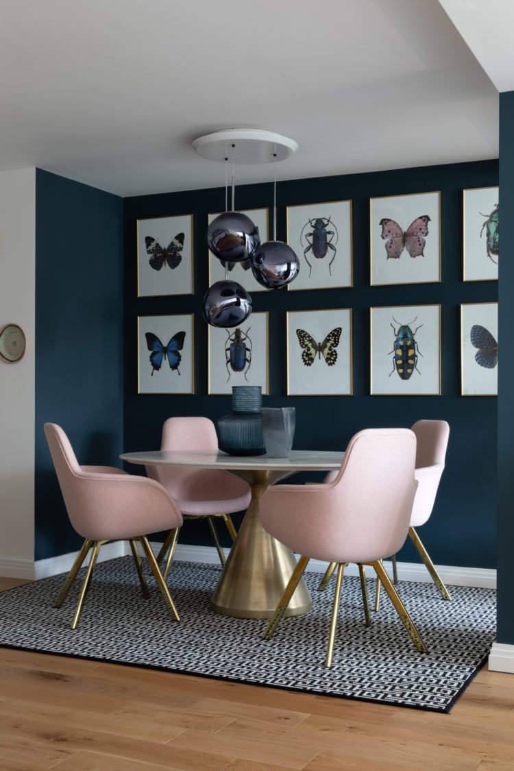
Art that’s too small
In a similar vein to rugs that are too small, art that’s too small can have an impact on how your space looks too. It’s all about scale; if you have a really small piece of art on a large wall, it can seem like it’s floating and out of place.
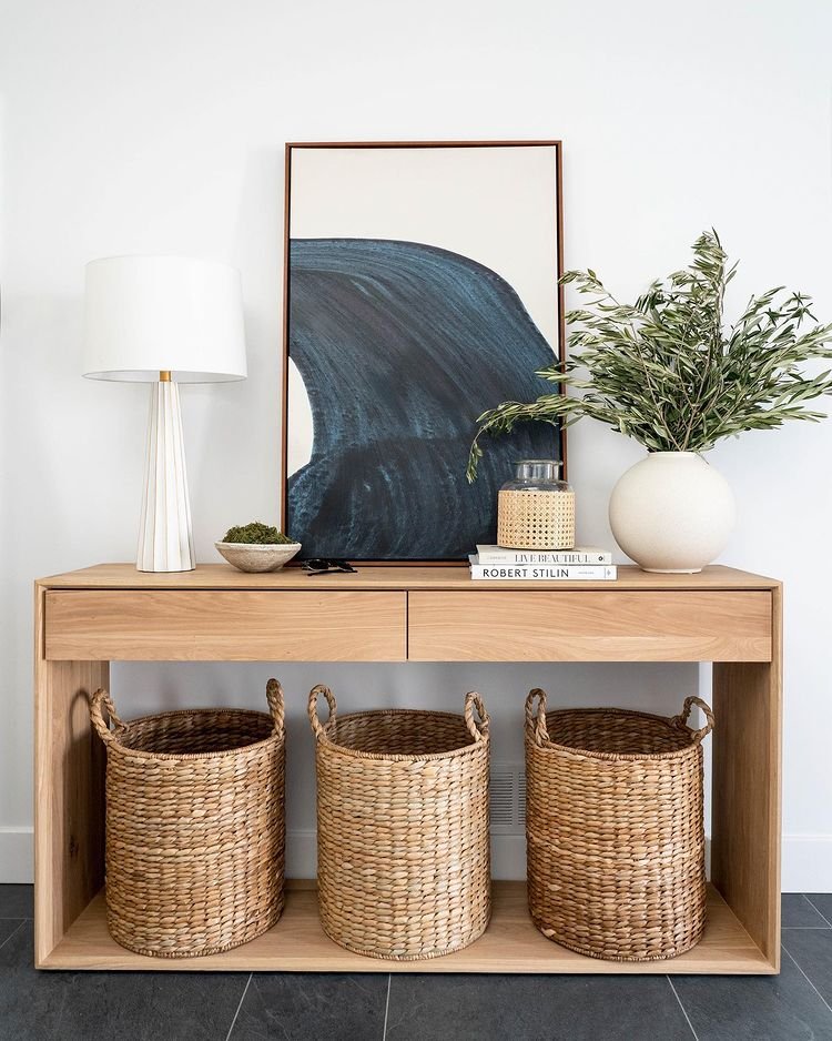
If you’re hanging art above a piece of furniture, like a sideboard or a bed, try and get it so that the art is around 2/3 the width of the furniture underneath.
That doesn’t mean that you have to go out and invest in giant pieces of art; grouping art works just as well whether it’s a pair of A3 prints or a gallery wall.
See my blog post: How to choose art and prints for your home
Image via Unsplash
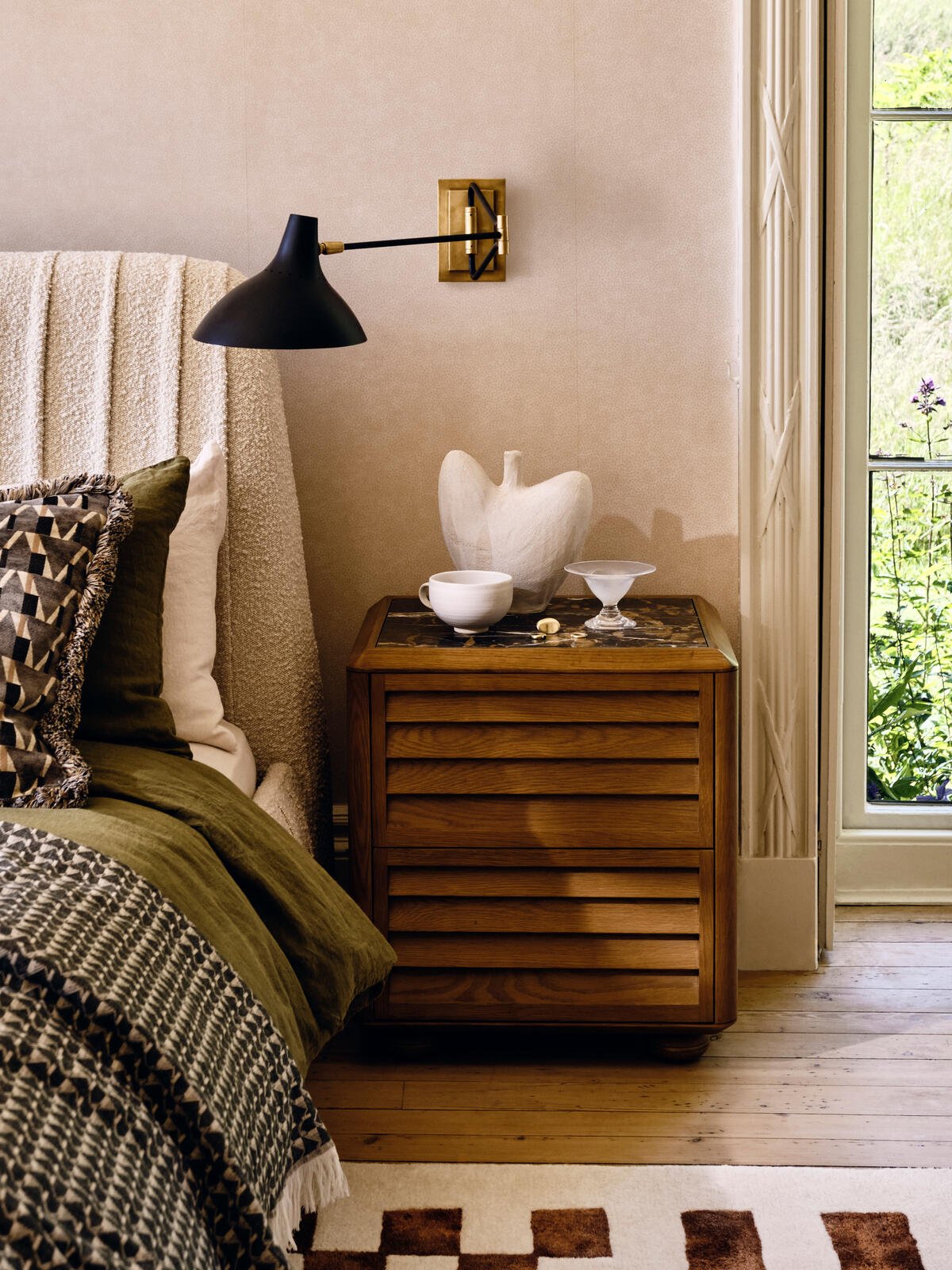
Lack of light sources
One of the first things I ask every client is “how do you want to feel in the room?” and with living rooms and bedrooms, the answer is almost always “cosy”. The number one way to achieve this is with layered lighting, so that we’re not relying on harsh overhead lighting to light the room in the evening.
Wall lights (these don’t have to be wired in, there are plenty of plug in options available now), floor lights and table lamps can be combined to create soft and ambient lighting for a cosy room.
See my blog: Choosing the right lighting for your home
Lighting schemes, both from Ikea
Matching everything
Decor from Reserve Home
There’s a balance between making a cohesive scheme, and something overly matchy-matchy which looks like it comes from the Argos Catalogue or a hotel.
Rather than buying everything from a matching range (bedding, cushions, curtains, lampshades) the trick is to think about your colour scheme and have 4-5 colours in mind for the room, and then source your accessories accordingly.
Go for a variety of patterns and textures - you want it to look like you’ve thought about and collected the pieces over time rather than gone out and bought them all in one go from the same place.
See my blog post: How to choose a colour scheme for your room
Decor by Kate Wiltshire Design
Missing a focal point
Every room needs a focal point, which is where your eye is immediately drawn to as soon as you enter a room. In a living room this might be a fireplace, or a large headboard in a bedroom.
Not every room is blessed with an architectural feature, and so it’s fine to make your own focal point, whether that’s a statement wall (marmite of the interior design world, I don’t mind them them), a gallery wall, or a large styled piece of furniture with art above.
Image from Mad About The House, photo by Paul Craig
If you’d like my help with your next project, check out my services to see how we can work together.


