How to style a shelf
Shelves are a great opportunity to showcase some personality and style, and having a shelf spruce up is a great way to breathe some new life into a room. Here are some tips to help you create styled shelves which are aesthetic, visually balanced and cohesive.
Consider the room as a whole
Source: Kate La Vie
Source: The Suki Shoppe
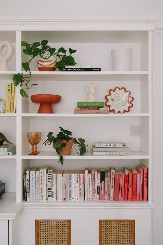
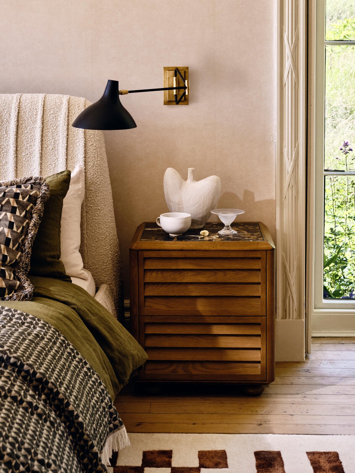
As with anything you put into a room, it’s a good idea to consider what’s already in the space and to view the room as a whole. Ideally the shelves should blend in seamlessly with their surroundings, so when choosing objects, think about the style of the rest of the room (is it modern, traditional, minimalist, maximalist?) and the colour palette too.
Group objects together
Source: Kate Wiltshire Design
Source: Kate Wiltshire Design
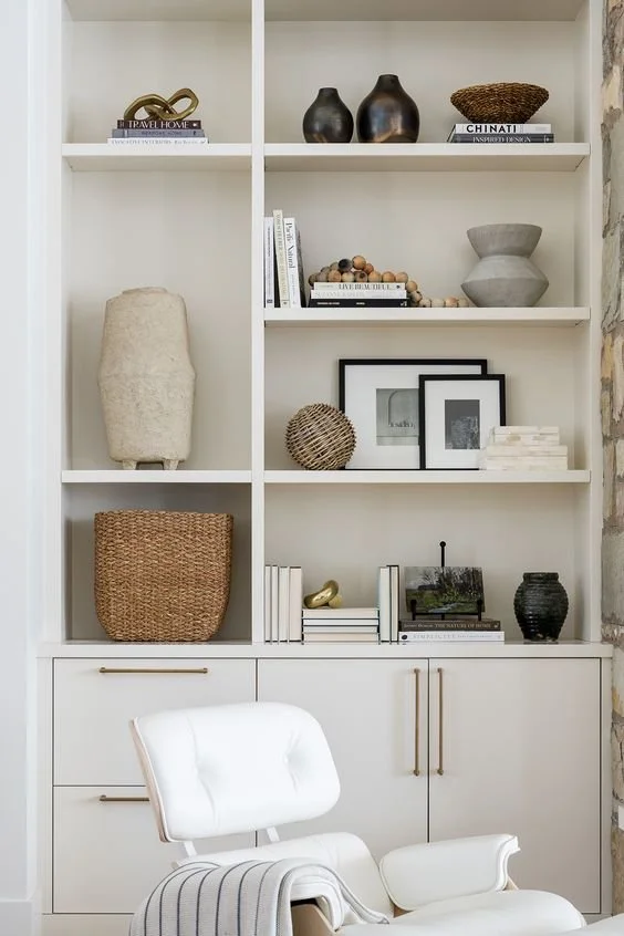
Grouping objects together is a fundamental part of styling any space - the science behind it is that it’s easier for our brains to take in objects that are close together rather than separated. Grouping objects makes a space feel less cluttered and satisfies our brains need for order and pattern!
Using odd numbers to group items together makes for the most visually appealing arrangement, so group your objects into 1, 3 or 5s.
Alternate positions per shelf
Source: Kate Wiltshire Design
Source: Kate Wiltshire Design
Once you’ve got your groups of objects, try alternating where they go on each shelf. So on the top shelf you might put one group of objects in the center of the shelf, and the one below you would put two groups, one to the left and the other to the right.
Alternate the position as you go down the shelves and it will create a balanced look which doesn’t feel too monotonous.
Use layering and consider scale
Source: Kate Wiltshire Design
Source: Studio McGee
Within our groups of objects, look for a variety of shapes, sizes and heights. Layering objects looks great - for example a large picture stacked behind an ornament or propped up on a book.
One really important tip is to not use objects that are too small - ideally you want a mixture of sizes but that should include objects that are tall so that they fill the vertical space on a shelf.
Allow for some negative space
Source: Kate Wiltshire Design
Source: Stoffer Home
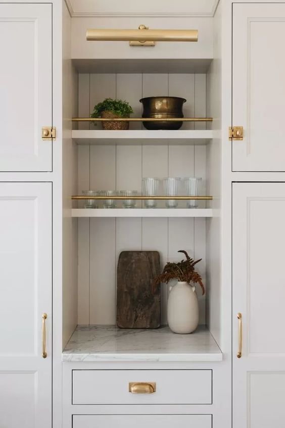
Finally, it can be tempting to fill all the space on a surface, but not only is that a nightmare to clean, it can quickly look visually cluttered. Embrace negative space - whether that’s having just one singular larger object on a shelf and nothing else, or grouping objects to one side and leaving the other side empty.


