10 creative bathroom tile ideas
When it comes to designing a bathroom, the choice of tiles can make all the difference to the design. The right tiles have the power to elevate the design and tone of a bathroom, so here’s some creative tile ideas to get you feeling inspired.
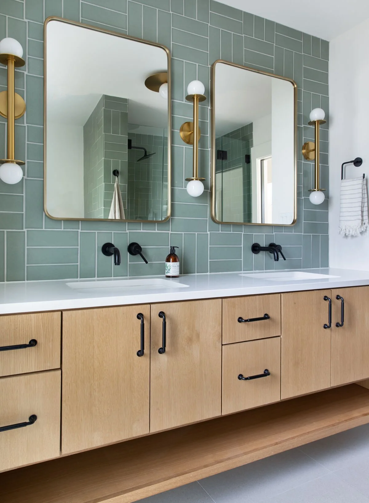
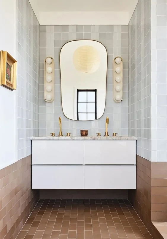
1. A parquet inspired brick tile layout
Source: Fireclay Tile
Brick tiles are so versatile and can be laid in lots of different patterns, the most classic choice being the subway or offset pattern (like bricks in a wall). In this bathroom they’ve taken a classic shaped tile and given it a twist by laying it in a parquet pattern - which is really simple but effective.
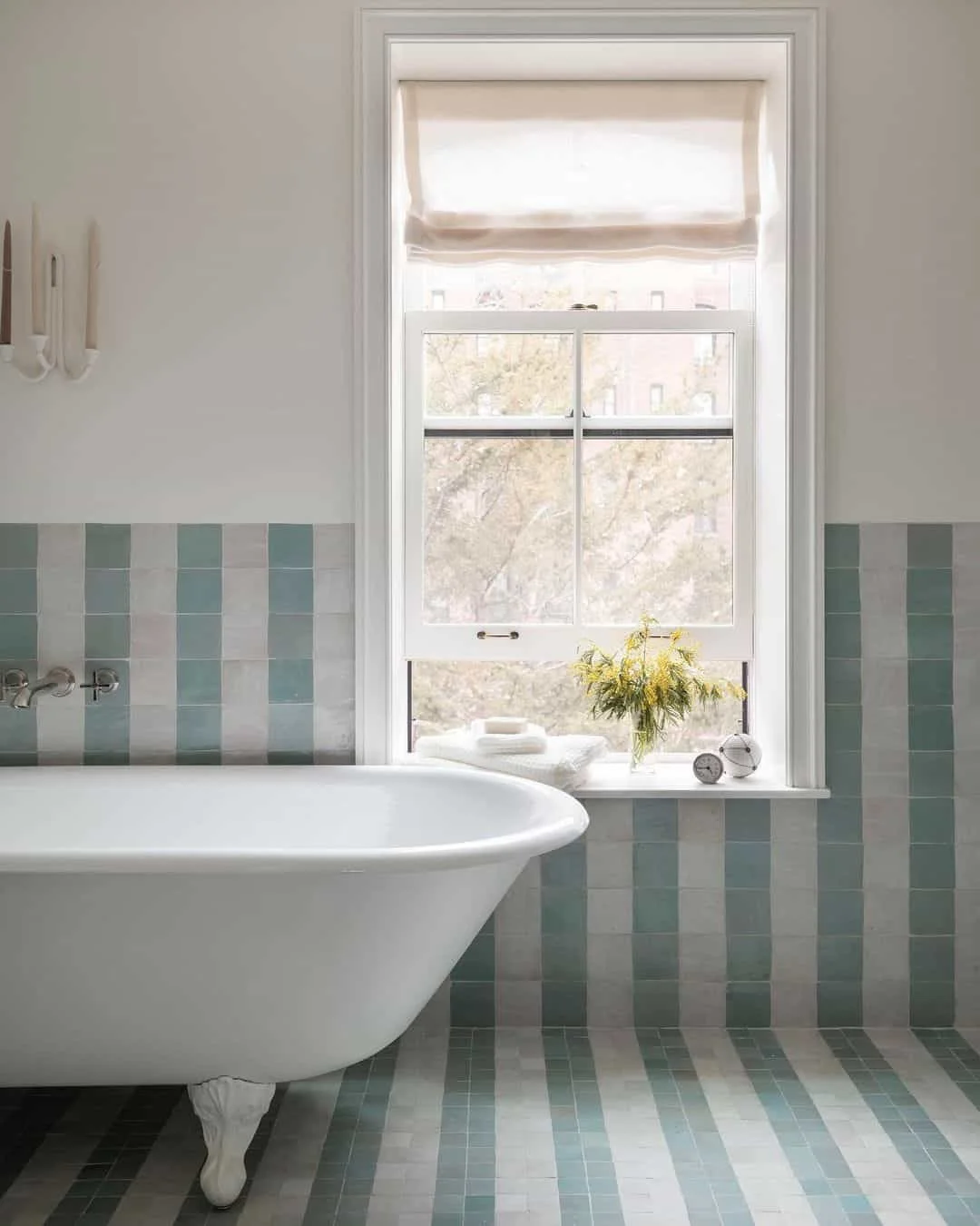
2. Zellige stripes
Source: Elizabeth Roberts
Zellige tiles are tiles which are handmade in Morocco, known for their variations in colour and texture. They’re beautiful on their own, but in this instance have been laid in a stripe pattern which is so striking and emphasises their lovely texture.
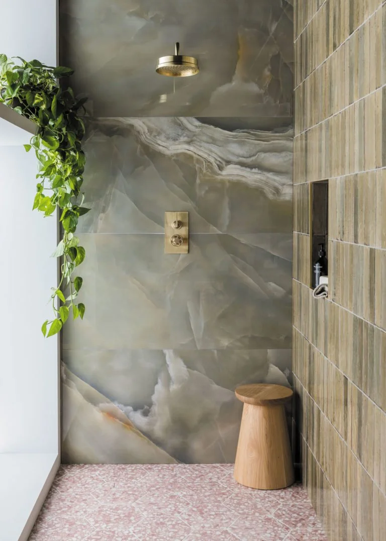
3. A mix of scale, texture and pattern
Source: Mandarin Stone
There’s a lot going on here but it’s certainly a unique combination and somehow it just works. The green tone of the Onyx and the brick tiles looks great against the pink terrazzo floor tiles, and there’s contrast too in the scale of the tiles and their shape.
4. Two tone
Source: Claybrook
More Zellige tiles here, this time they’ve been used to create this really nice two tone look which is again a really simple idea but an effective one, especially with that wooden ledge separating the two. I particularly love how they’ve used the same tile just in a different colour, the result is really simple and chic but still impactful.
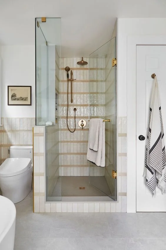
5. Horizontal stripes
Source: Ruemag
More stripes! I do love a stripe. This design has combined vertical stacked tiles with horizontal ones in a contrasting colour for another simple but effective look.
6. High contrast two tone
Source: Domino
Here’s another version of a two tone look, this one is a little more punchy as it’s a higher contrast between the white and the brown tiles (who would have thought brown tiles would look this good?) They’ve also combined another technique in the white tiles, introducing a subtle stripe.
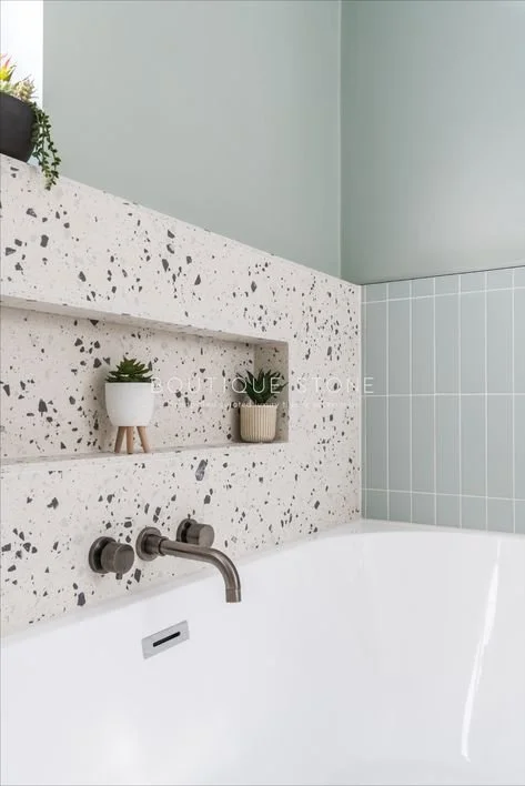
7. Highlighting a niche with terrazzo
Source: Boutique Stone
A niche is a great addition to the side of the bath - a little pushed-in area in which you can put shampoo bottles and other bits. I like how they’ve made a focal point out of it in this bathroom by using a highly decorative terrazzo tile against the more muted wall tile.
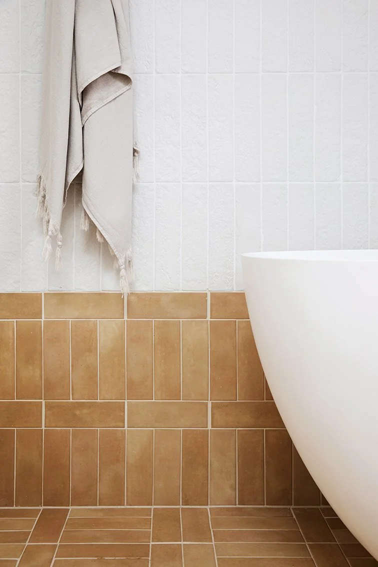
8. Another creative brick layout
Source: Three Birds Renovations
Here’s another really simple but effective way to make brick tiles look a bit more unique. In this layout they’ve stacked one row vertically, the next horizontally, and so on. They’ve done this for the statement orange tile, and then the white above has been stacked vertically. Love it.
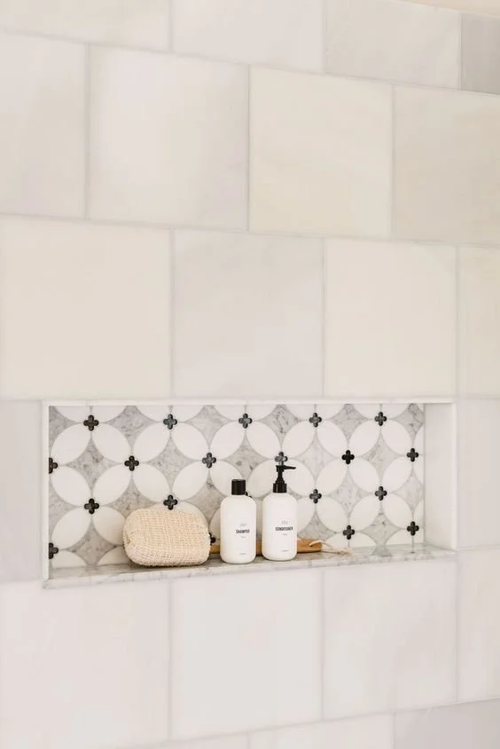
9. A subtle niche accent
Source: Delphinium Design
If you’ve got a niche in the wall of your shower, rather than highlighting the entire wall as per number 7, you can highlight just the inside of the niche with an accent tile. Just like a little design surprise.
10. A colourful patterned floor
Source: Fireclay Tile
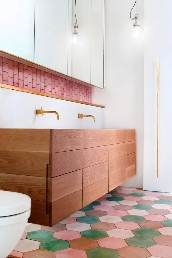
Finally… you’ll find when you start looking for tiles that manufacturers often make the same tiles in multiple colours. Rather than sticking with one colour, in this example they’ve chosen a few colours and randomly used them throughout the floor - again a really simple but a really effective idea.
If you’d like my help with your next project, check out my services to see how we can work together. If you’ve enjoyed this blog, don’t forget to subscribe at the bottom of this page to receive my new post in your inbox every Sunday.


