Inspiration: Highlights from the 2021 LivingETC house tours
This week I went to the LivingETC house tours, meaning I was able to snoop around 6 beautifully designed real homes in the Primrose Hill area in London.
From single floor flats up to 5 storey town houses, each one was more impressive than the last. I lost count of the times I said "wow" out loud, despite being there on my own (got a few odd looks, mind...).
So, with the hopes of inspiring you, without further ado here are some of my highlights from the day.
Click on each image to expand.
Personality
There was so much personality on show, and as a believer that your home should reflect who you are, I loved it. There was some really brilliant, giant statement art work, as well as items on display that immediately told you about the people who lived there.
Colour was used playfully too, like this room with a pink radiator. There were rooms which made me smile, or even laugh as I walked in, and that’s exactly what I love about interior design!
Skylights & Glass floors
Speaking of rooms which made me laugh, this house blew my mind - it was a 3 storey house hidden in a very quaint little mews. The architectural decisions here were amazing, they had added a sky light to every floor so that you could see the sky even when stood on the ground floor. I thought it was so clever and unique, although probably not ideal if you’re in a skirt.
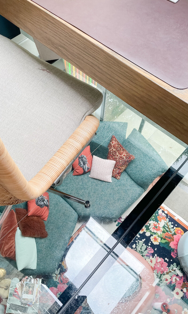
This was a home office with a difference. A glass ceiling from the basement was also the floor of the little office space above, meaning that light flooded the basement not just from the patio doors, but from above too.
Pattern
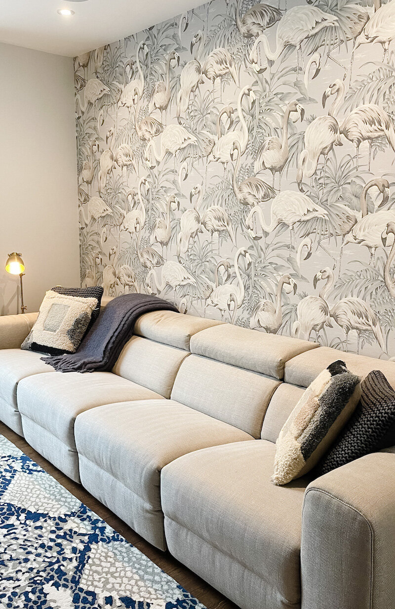
I absolutely loved the pattern clashing that was going on, and that the owners clearly weren’t afraid to go big with patterned wallpapers. I immediately smiled when I walked into all of these rooms.
Inside-out
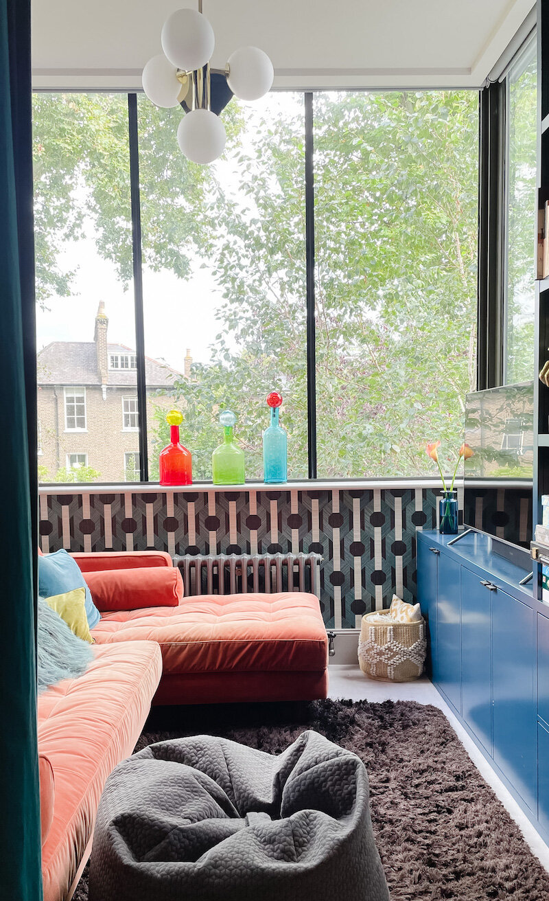
Unsurprisingly, all of the homes had lovely gardens too, and the architectural choices had seamlessly merged the inside and outside. Big, uninterrupted glass panels which wrapped around extensions let in light but also greenery and visual interest. And not just on the ground floor - like in this snug on the first floor (last photo).
En-suite excellence
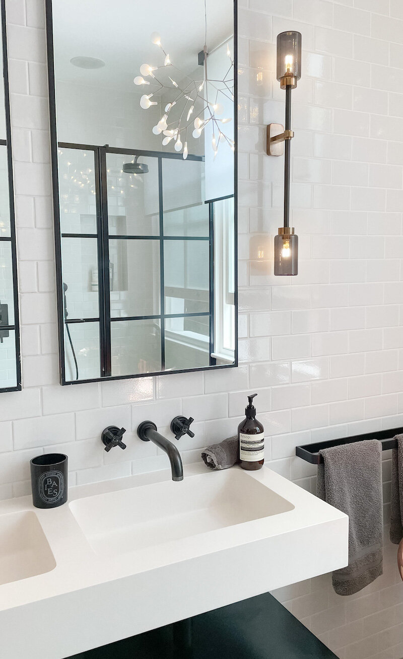
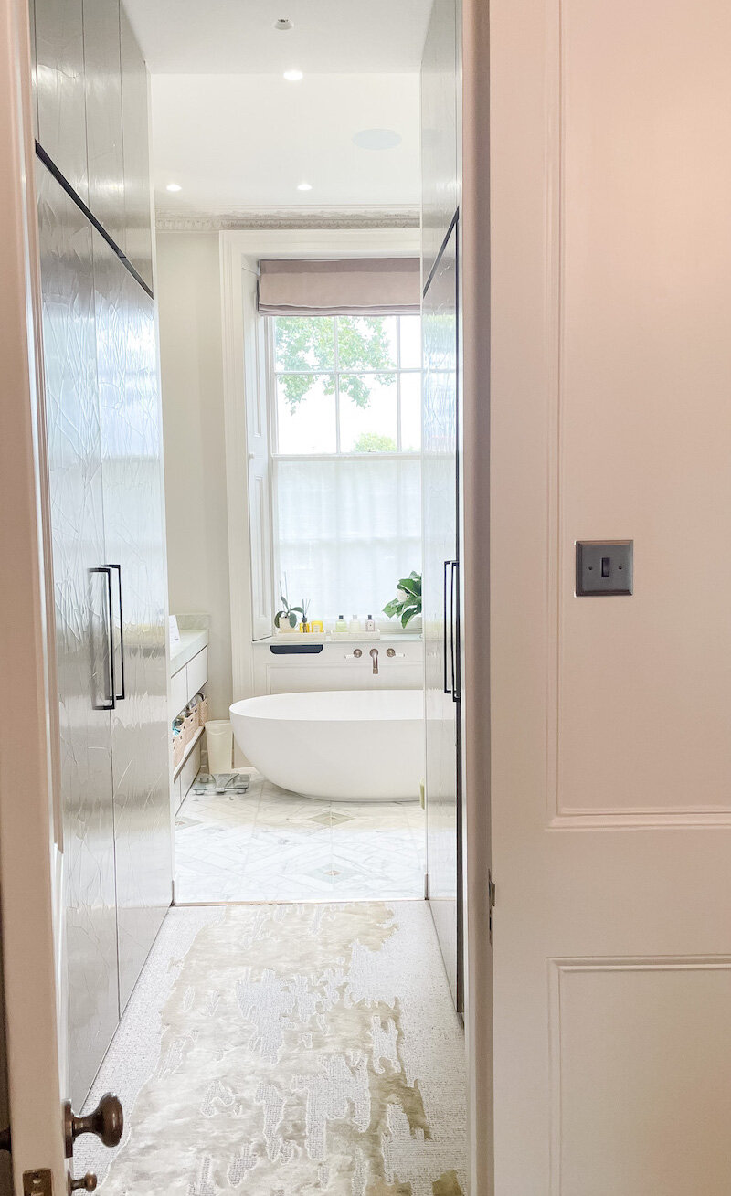
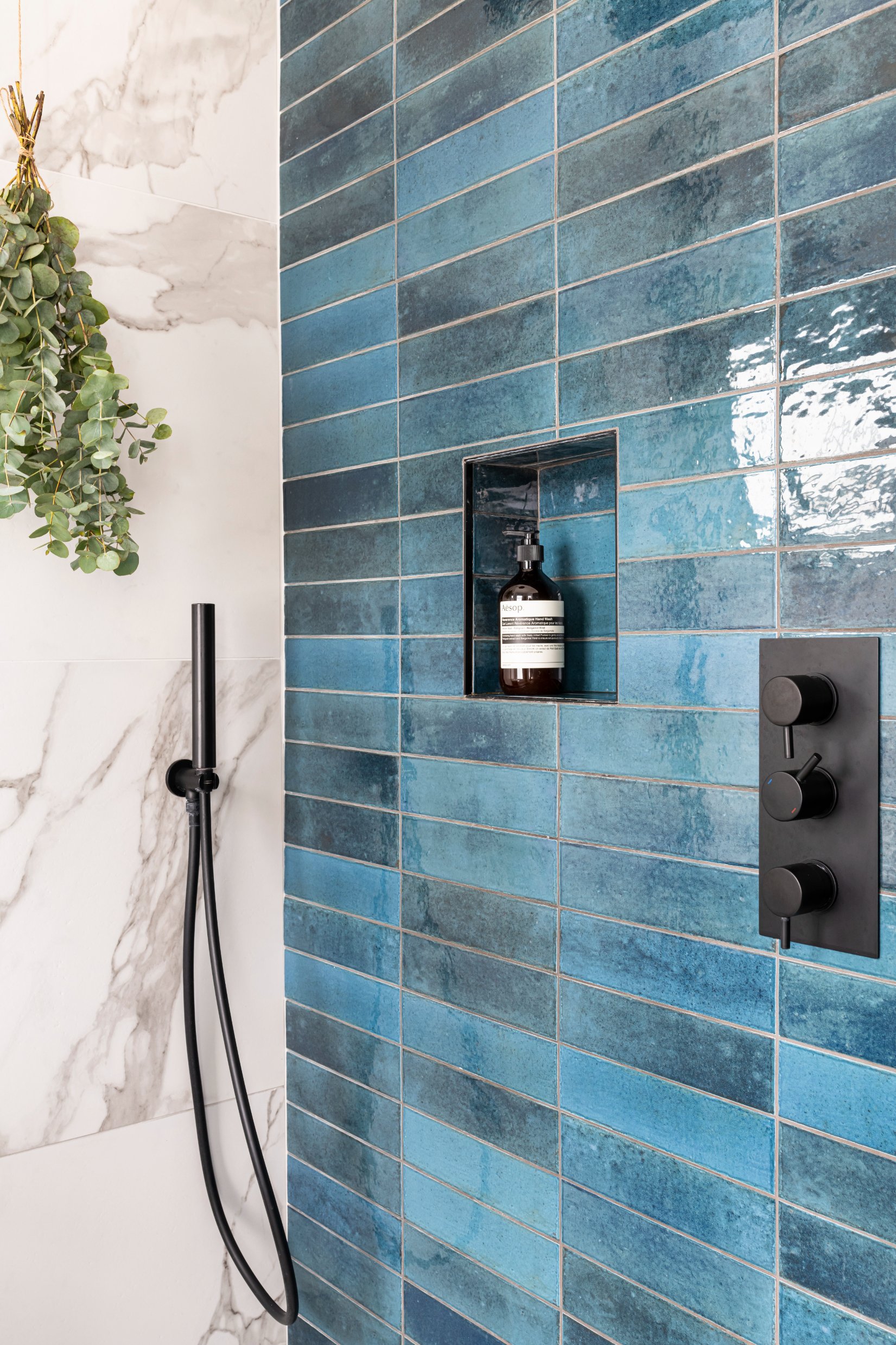
Most of the houses were lucky enough to have en-suites, and there was plenty of bathroom inspiration. Featuring lots of crittall - used in shower screens, as well as dividers to mark off the entrance to the en-suite.
I'm forever walking around wondering what the inside of houses are like - and this tour really satisfied that nosy part in me!
Not only that, but I left feeling so inspired and even more in love with interior design than before. I'd thoroughly recommend going next time, whether you are in the industry or simply want to have a snoop for some inspiration.
If you’d like my help with your next project, check out my services to see how we can work together. If you’ve enjoyed this blog, don’t forget to subscribe below to receive my new post in your inbox every Sunday.


