Feature walls - yay or nay?
Feature walls have been around for ages - the idea of painting one wall in a room a different colour to the others. Despite their popularity, they are seen as the marmite of the interior design world - some people love them, some people hate them. So… is it a design mistake to add a feature wall? Here are my thoughts.
Benefits of a feature wall
Zone a space
Source: House Beautiful
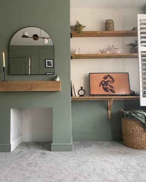
Using colour on a section of a room helps to mark that space as a different zone to the others. So in a large or open plan room, adding colour to a feature wall can help to visually separate the large space into smaller spaces.
Provide a focal point
Source: Apartment Therapy
A lot of modern homes have the problem of a lack of focal point - very often their rooms, especially living rooms, are blank boxes. Every room needs a focal point, so by painting one wall you are creating one place where the eye is drawn to immediately, which is useful when there is a lack of any other focal point in the room.
Change or emphasize the shape of a room
Source: Kate Wiltshire Design
Source: Cote Maison
I’ve written a blog post on how you can use paint to change the shape of a room, which is something to keep in mind if you’re planning on adding a feature wall. Depending on the proportions of the room and the colour of the paint, you can make a room feel wider, more narrow, shorter or longer.
When not to use a feature wall
Fear!
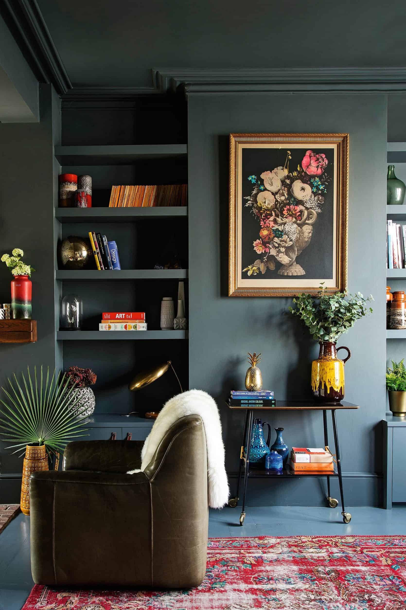
Source: Abigail Ahern
Quite often I chat to clients who love the idea of going bold with colour on the walls, but are afraid to do so. Resorting to only painting one wall is a way to bring some of the colour into the space, but it doesn’t have the same effect as colour drenching. If you love the look of a colour and you want it on all the walls - then I say go for it and don’t let fear or anyone else’s opinion hold you back.
Walls with windows and doors
Source: Delightfull.eu
One place where I don’t think feature walls work, is when the wall itself has a lot going on already in terms of doors and windows. Window and door trim and hardware is already visually busy, and by painting it’s backdrop you’re drawing more attention to what is probably not a very symmetrical area, or one that you’d want as the focal point.
In a visually busy room
Source: Historika Hem
By adding a feature wall, you’re essentially including two colours on the wall, which is going to give less of a streamlined or calming look than if you were to use one colour. If you’re someone who likes more of a busy look (like shelves with lots of decor, art, gallery walls, lots of colour, etc) then you run the risk of the space becoming visually cluttered. Going for a neutral or consistent colour on the walls instead helps the items in the room to shine more rather than fight with the backdrop.
Feature wall tips
They don’t have to be just colour
Source: Anita Yokota
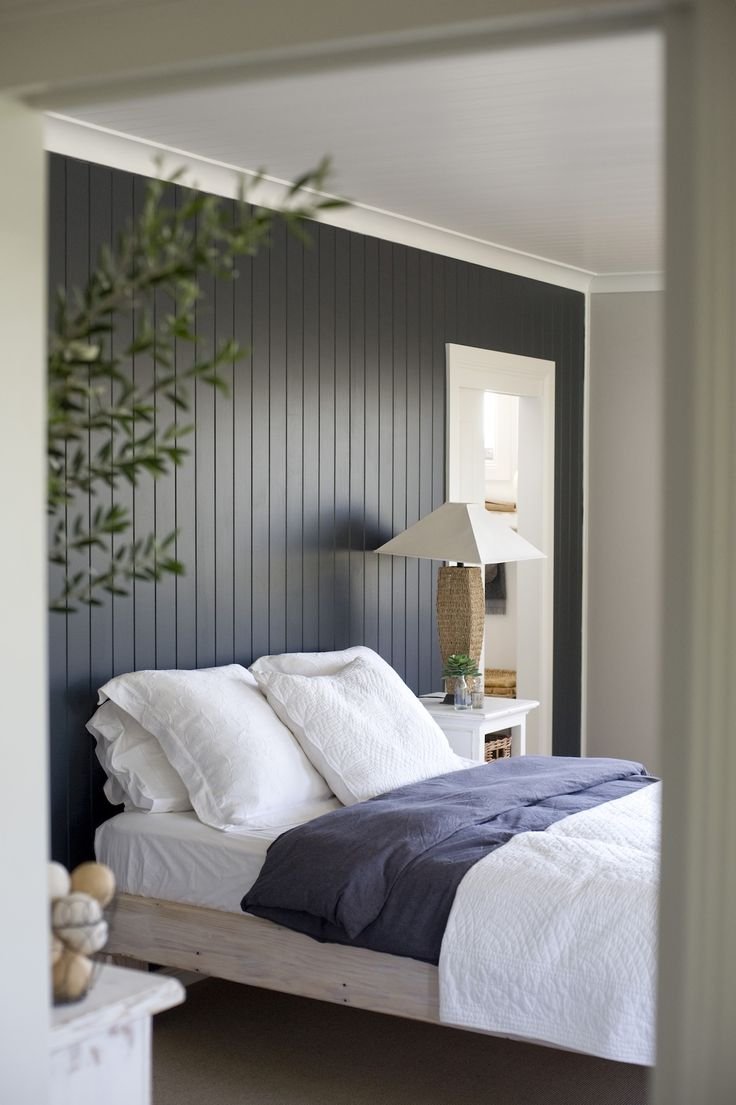
Feature walls can be anything which makes the wall stand out differently from the others in the room. So that can be anything from panelling, wallpaper, or murals.
Include the skirting board
Source: Funky Chunky Furniture
Painting the skirting on the feature wall the same colour will help make the space feel less visually busy. This is opposed to having a band of white (i.e. the white skirting) between the wall colour and the floor.
Tie it in with the rest of your decor
Source: Studio McGee
Before you decide on a feature wall, have a think about whether it fits in with the aesthetic in the rest of your house. For example if your home is a formal or traditional style, then feature walls might not be typical to that design style. Likewise adding shaker style panelling wall, or a kitsch wallpaper to an ultra modern home might not gel well with the rest of the home.
Give it a purpose
Source: Emerald Terrace
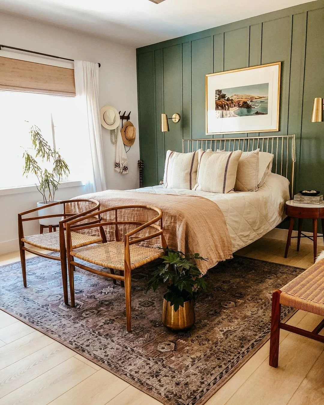
And finally - the most important tip - is only add a feature wall if there’s a reason for it to be there. It should act as a focal point in the room, so add it to the wall that you want the eye to be drawn to. This could be the fireplace wall in a living room, or the headboard wall in a bedroom.
If you’d like my help with your next project, check out my services to see how we can work together. If you’ve enjoyed this blog, don’t forget to subscribe below to receive my new post in your inbox every Sunday.


