New project: Bringing Soho House to Herne Hill
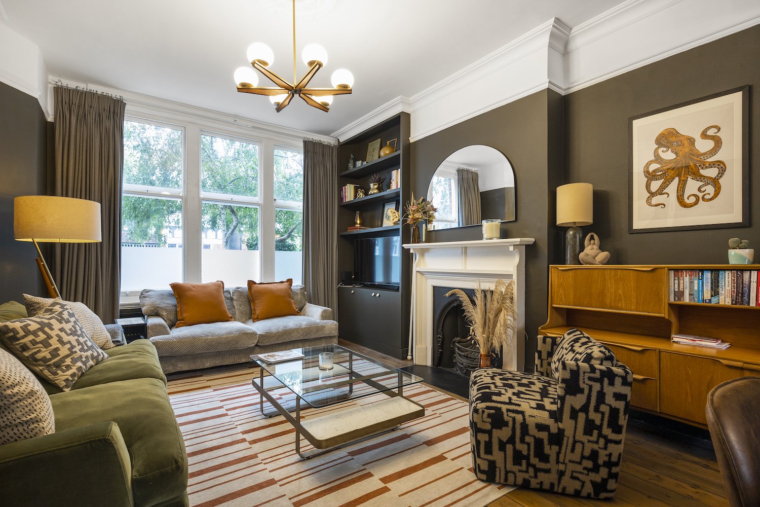
When my client told me she wanted dark brown walls, I knew this was going to be a unique project! This beautiful Victorian room had so much potential, with a huge light-filled window, tall ceilings and plenty of space.
When we started talking about my client’s tastes and inspiration for this room, it became apparent very quickly that we were going for a Soho House vibe: a maximalist but comfortable style with a mixture of the vintage and contemporary.
Once we’d added cornicing and a ceiling rose for detail, plus a built-in alcove TV unit, we could focus on colours and furnishing. The key to achieving the Soho House cosy, eclectic and put together look is to nail three things: lighting, texture and scale.
Lighting
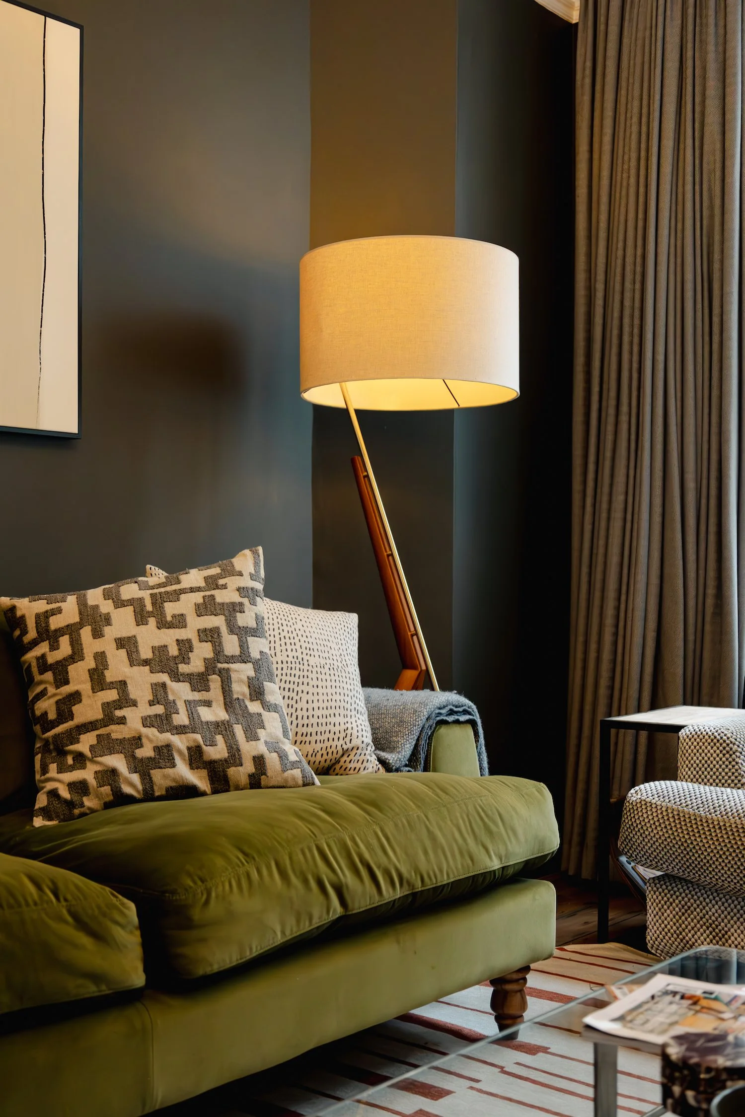
My client already had a beautiful mid-century sideboard, so we used this to inspire the lighting throughout the room. A beautiful Soho Home chandelier was hung from the ceiling rose, and a mid-century floor lamp from West Elm provides light and style in the corner. We made sure to add ambient lighting in every corner of this space, so that in the evenings the overhead light can be switched off (but still looking fabulous).
Texture
Every piece of soft furnishing we included in the design was considered - we aimed to bring in as much pattern and texture as possible to give that elevated layered and maximalist look. We re-covered my client’s existing sofa with a new bubble velvet fabric from Sofa.com and contrasted this with a rich olive green sofa alongside it. We included some bold and punchy patterns - the highlight being the amazing Abigail Ahern armchair which clashes perfectly with the Ruggable rug. Brown marble and leather was also repeated throughout the design, on the dining table and chairs, bar seats and accessories.
Scale
When filling a large living room space like this one, it’s important to get the scale right - too small and the elements start to look apologetic or like they’re a bit lost. Large scale pieces look dramatic and confident, so we made sure to go oversized with the rug as well as the large abstract art above the sofa. We weren’t afraid to fill the space with colour, texture and pattern, and it’s safe to say the client is over the moon with the results.
Check out the entire gallery on the project page here:


